主題
Introduction to Responsive Web Development with HTML and CSS - U6 - Responsive techniques
---
(這是用Markdown寫的文章,可以全選複製貼到 https://dillinger.io 左側,就能看到正常渲染畫面)
---
(這是用Markdown寫的文章,可以全選複製貼到 https://dillinger.io 左側,就能看到正常渲染畫面)

---
The responsive design is based on a flexible structure, based on percentages, and special CSS rules that are called media queries. We are going to see an introduction and in the following lessons we will see it in more depth.
## Responsive techniques
===
### Responsive design and Mobile First (Small Screen First)
關鍵在先考慮小螢幕,根據優先權的權重,也就是資源(螢幕尺寸)不足時要先顯示比較重要的畫面,其餘次要的可以省略
彈性 (flexible) 分配的關鍵:
- 元件依照 比例 (percentage) 分配,而不是絕對寬度、高度
- 依據螢幕和 container 空間大小,重新分配排列結構 (rearrange structure)
舉個例子:
@ 大尺寸螢幕觀看的網頁結構
@ 尺寸縮小時,網頁結構重劃 (redrawn) 成single coloum 單欄式頁面
===
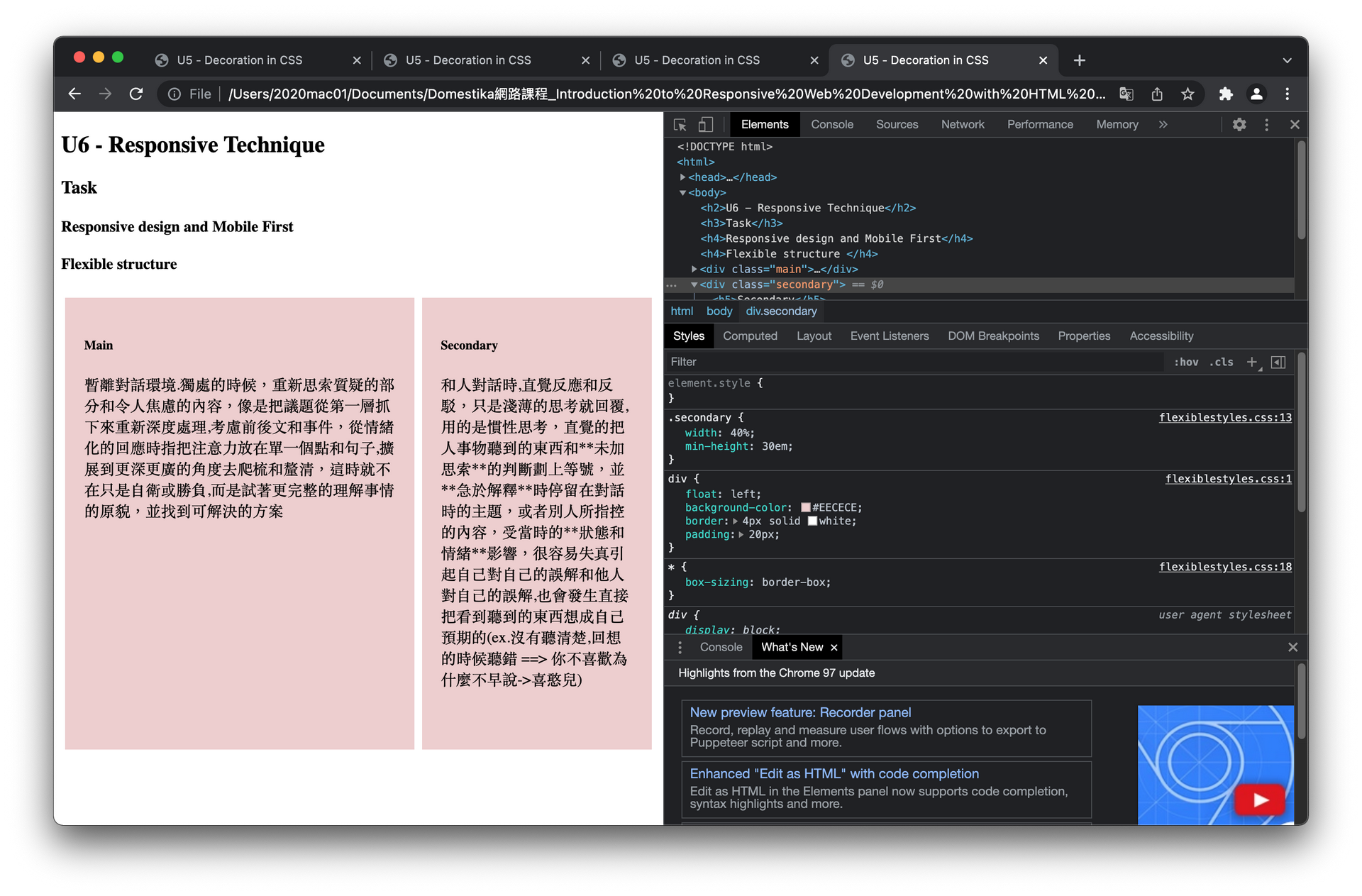
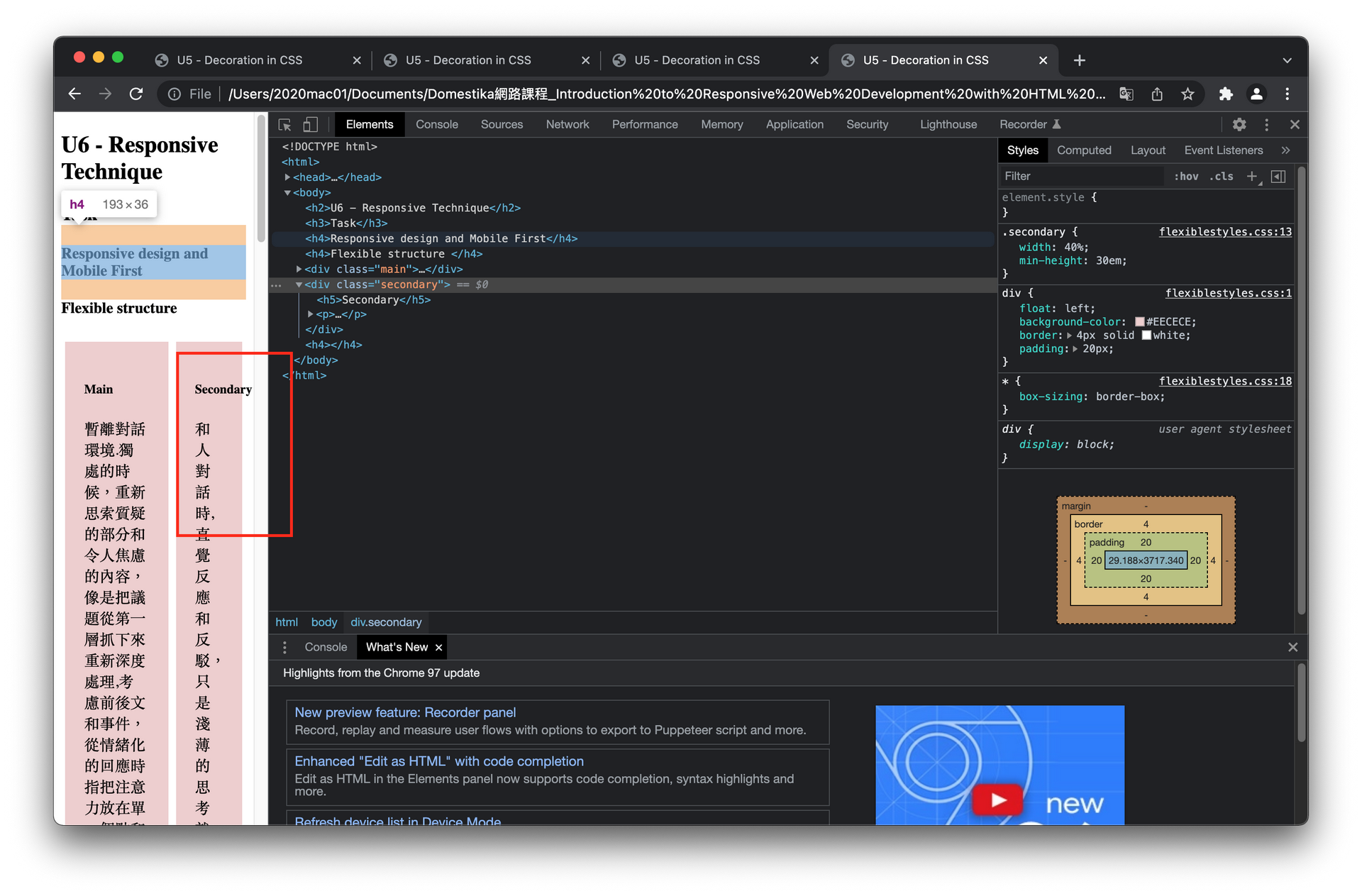
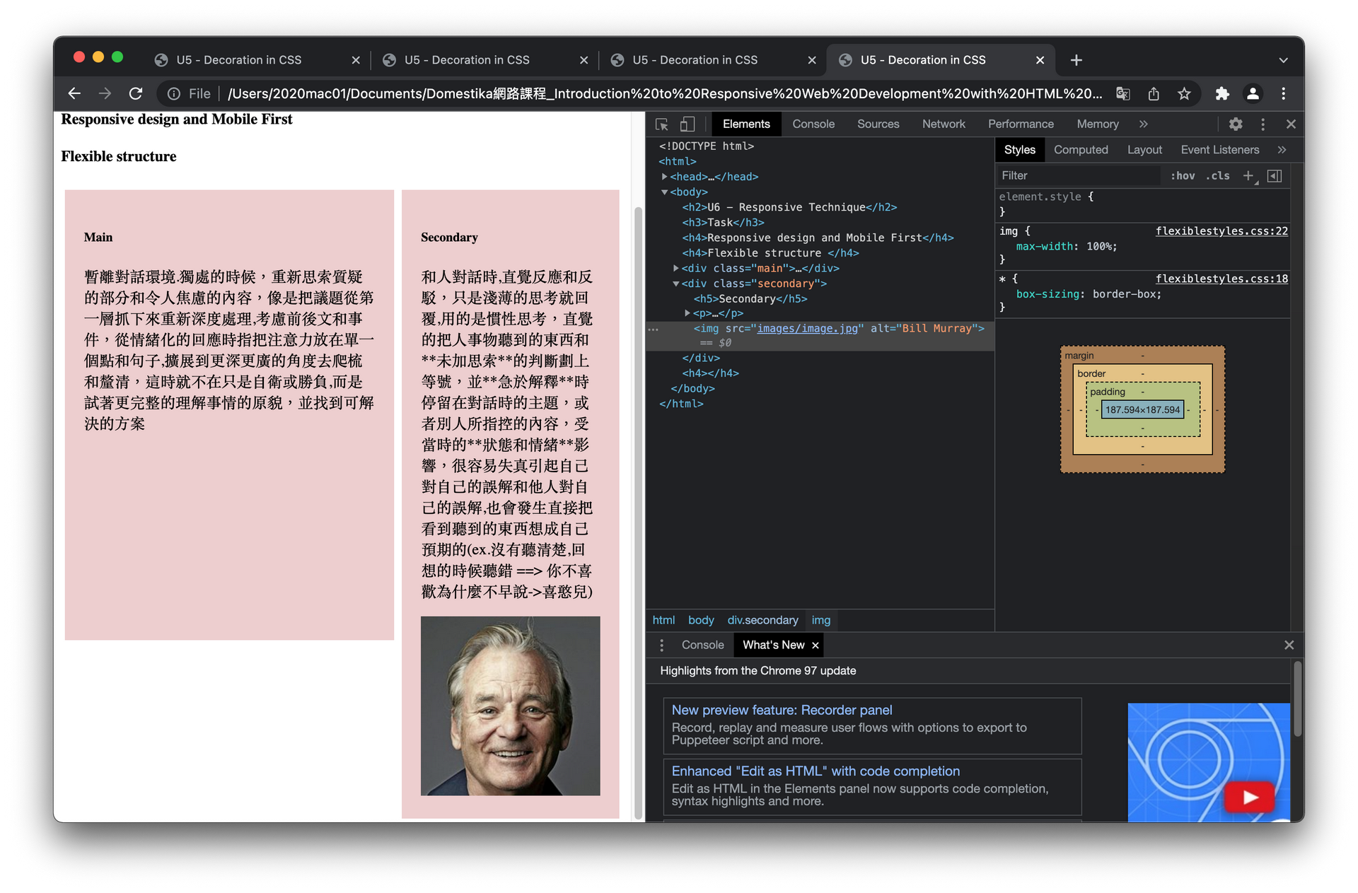
### Flexible structure
不使用絕對寬度, 而使用百分比來建立自適應的網頁版面
```
.main{
width: 60%;
}
.secondary{
width: 40%;
}
```
但是只使用百分比的方式縮放尺寸到某程度會造成結構破壞,超出 container,因此需要用到 media queryies 的方式, media queries 下一個單元再提
@ 只使用百分比的方式縮放尺寸到某程度會造成結構破壞, 超出 container
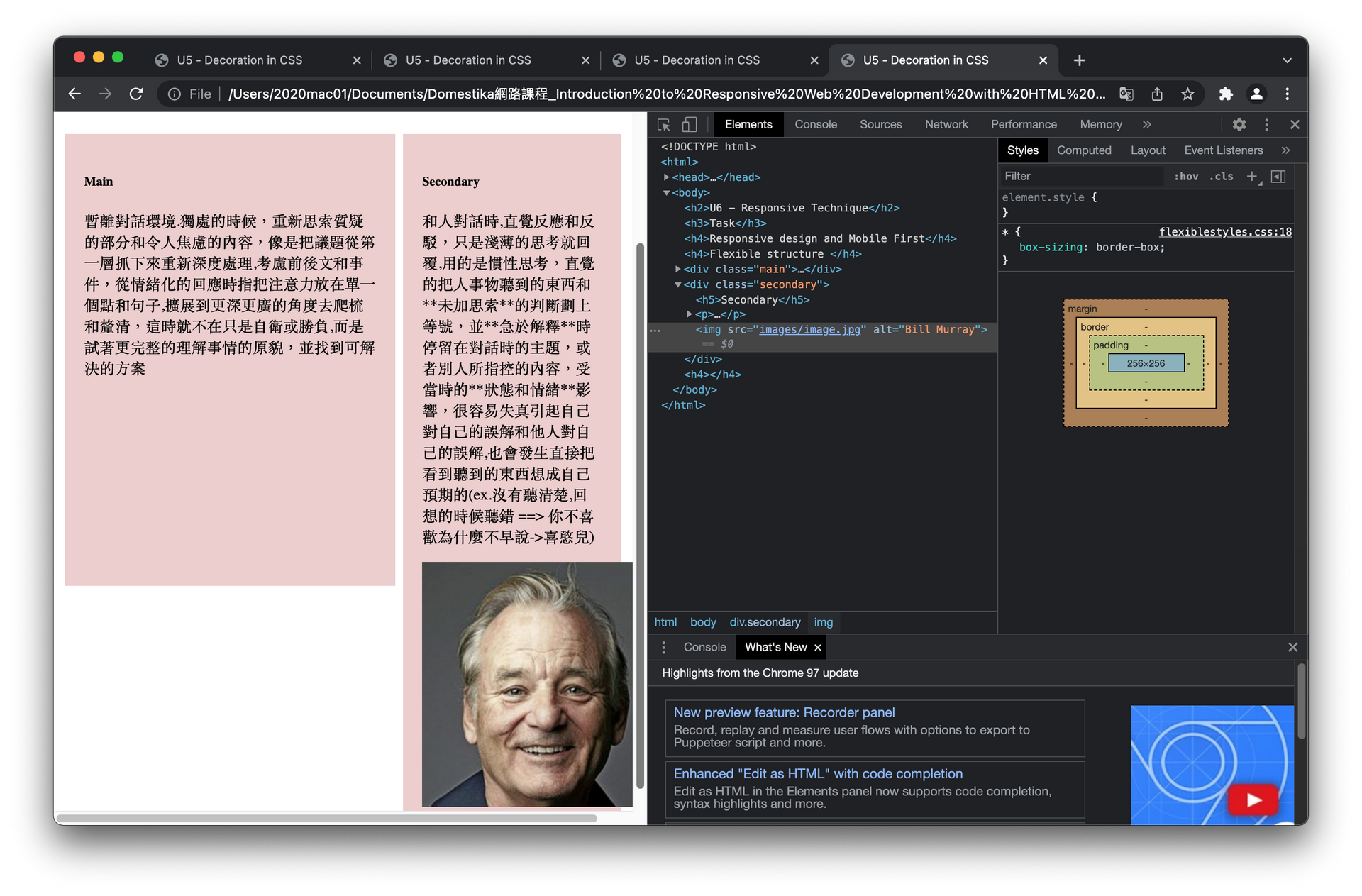
@ 另外插入圖片的情況也是會超出 containe,需要設定百分比
```
img{
max-width: 100%;
}
```
@ 設定完圖片寬度百分比`max-width: 100%;`後
===
### The average queries
#### media queries
ref:
(因為沒有節錄過來.請點進來看 Media queries 介紹)
- [CSS Media Queries 詳細介紹](https://www.oxxostudio.tw/articles/201810/css-media-queries.html)
- [CSS Media Queries 介紹與基礎應用](https://muki.tw/tech/css-media-queries-introduce-basic/)
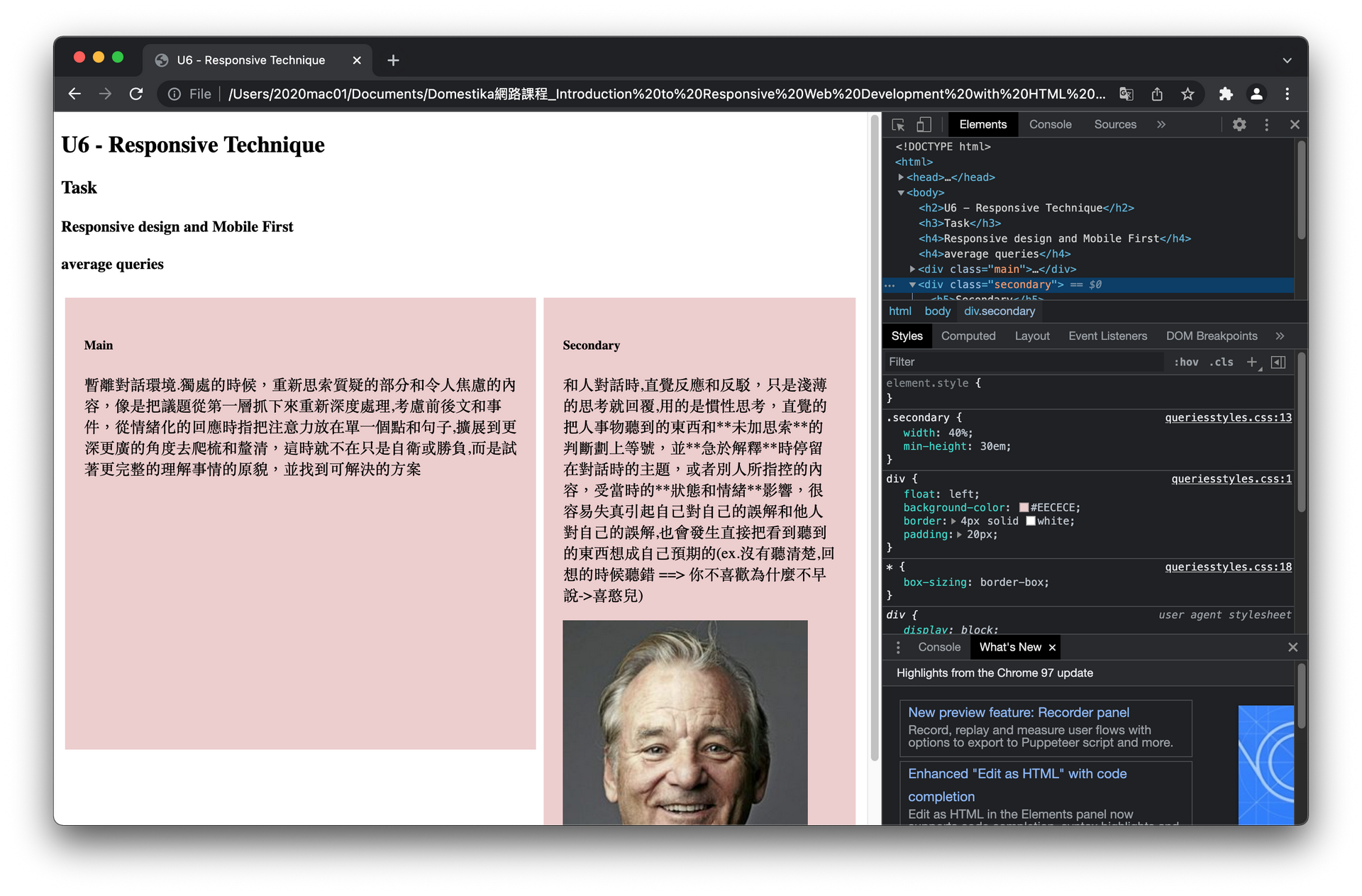
上面學到讓兩個區塊等比例縮小,但是我們仍然需要再尺寸縮小到一定程度時,把兩欄的頁面縮減到一欄在另外一欄下面也就是單欄式頁面,都是 100% 寬度,方便閱覽, 這時就要使用到 media queries
使用方式:
```
/* CSS */
/* 條件一 邏輯運算 條件二 */
@media screen and (max-width: 800px){
/* 此時套用的 CSS style 樣式*/
}
```
`@ media`: 宣告使用media queries
`screen`:代表條件是視窗模式
`and`:邏輯運算and,代表需要前後兩個條件都成立
`(max-width: 800px)`:代表條件是小於800px
所以上面的意思就代表,media queries符合視窗模式而且頁面小於 800px 時套用樣式
舉個例子:
```
<!-- html -->
<div class="main">
<h5>Main</h5>
<p>...</p>
</div>
<div class="secondary">
<h5>Secondary</h5>
<p>...</p>
```
```
/* CSS */
/* 視窗模式 而且 頁面寬度小於 800px 時 */
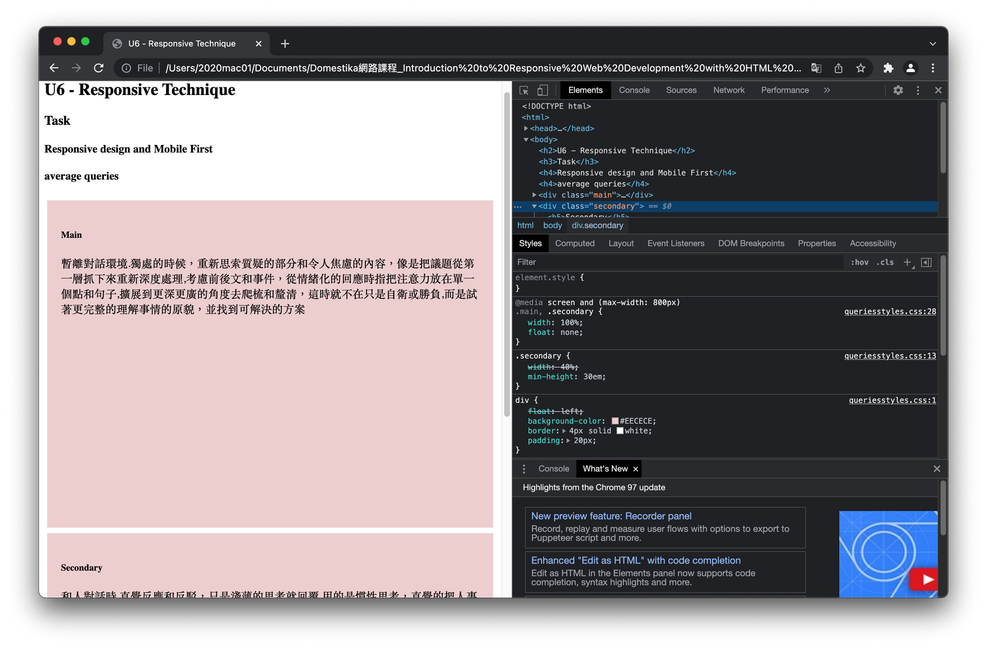
@media screen and (max-width: 800px){
.main,
.secondary{
width: 100%;
float: none;
}
}
```
@ 當頁面寬度大於 800px 時顯示雙欄
@ 當頁面寬度縮減到小於 800px 時顯示單欄
在 Chrome 和 Firefox 按 F12 開啟 Developer mode, 可以縮放或是直接選取模擬手機裝置,更改裝置顯示大小,確認網頁變化
剛剛已經設定小於 800px 時的網頁顯示,這邊再新增一個頁面寬度小於 1000px ,就可以套用顯示介於 800px 到 1000px 間的頁面樣式, 下面用來改變字體大小
```
/* CSS */
/* 視窗模式 而且 頁面寬度小於 1000px 時 */
@media screen and (max-width: 1000px){
h4,h5{
font-size: 24px;
}
body{
font-size: 16px;
}
}
```
以上是由 Desktop (桌機)優先來思考樣式變更,也就是由大到小,但若是以小螢幕為優先 (Mobile first) 的策略設計呢?
#### Mobile first design 小螢幕優先的設計
Mobile First 小螢幕優先的設計
- 先設定小螢幕初始樣式 (initial styles), 單欄100%,無float
```
/* CSS */
.main,
.secondary{
width: 100%;
float: none;
}
```
- 再來,使用 media queries 決定 min-width 的樣式,如下面是設定 大於 800px 的樣式
```
/* CSS */
@media screen and
(min-width: 800px){
.main{
width: 60%;
float: left;}
.secondary{
width: 40%;
float: none;}
}
```
- 再用 media queries 設定更大的顯示螢幕樣式,如下面是設定大於 1000px 的樣式,加大字型
```
/* CSS */
@media screen and (min-width: 1000px){
body{
font-size: 20px;
}
h1,h2{
font-size: 36px;
}
}
```
- 另外,如果要特別設定某個範圍的樣式,也可以額外指定,例如下面是設定 750px 到 950px
```
/* CSS */
@media screen and (min-width: 700px) and (max-width: 950px){
/* 設定樣式 */
}
```
#### 使用 meta tag 的 viewport
在 head tag 內使用 meta tag 的 viewport 可以在 html 中設定,讓頁面符合 mobile browser,這樣旋轉裝置時就不會zoom in,可以看到顯示頁面
```
<!-- html -->
<meta name="viewport" content="width=device-width, initital-scale=1.0">
```
===
### Responsive navigation
小螢幕上的導覽列 (navigation) 有個問題是,一整排連結列表會擋到內文,所以大部分的響應式導覽列 (responsive navigation) 會把導覽列隱藏起來,等使用者需要時才叫出來,如下例,當頁面寬度大於 600px 時,才能直接放一整排在最上方:
@ 頁面小於 600px 時,導覽列收在 Menu 裡,或放在最底下

@ 頁面大於 600px 時,導覽列顯示在上方
```
<!-- html -->
<!DOCTYPE html>
<html>
<head>
<title>U6 - Responsive Technique</title>
<meta charset="utf-8">
<link rel="stylesheet" href="css/navigationstyles.css">
</head>
<body>
<a href="#menu" class="launcher-menu" id="link-menu">Menu</a>
<h1>Menu responsive</h1>
<p>暫離對話環境.獨處的時候,重新思索質疑的部分和令人焦慮的內容,像是把議題從第一層抓下來重新深度處理,考慮前後文和事件,從情緒化的回應時指把注意力放在單一個點和句子,擴展到更深更廣的角度去爬梳和釐清,這時就不在只是自衛或勝負,而是試著更完整的理解事情的原貌,並找到可解決的方案
</p>
<p>對話時的句子,像是拋下來的球,有些直接反應的就泡回去一句話,有些則是不重要可以 DROP ,有些則是暫時沒有想法,KEEP 在上面,當思考或是對話時,這些球像是圖論裡的節點,把意圖轉換成一個接近的句子,接近但不能代表完整意思或容易引起誤解,當環境是public,其他人對這顆球做出反應 grab & throw,這顆球就像發炎一樣,正在引起自己的關注,焦點都放在上面,其他節點脈絡都縮到後面,對他人或事物的感受形成後,在這一層做直覺的反應
當開始思索質疑或令自己焦慮的問題時,好像把球抓下來,進行深度思考, consider 進行加工處理,得到更完整的解讀的球,改變對人事物的看法,也許足夠完整以及時間夠久以後會改變原先第一層的感受上直覺反應的部分,他人的 grab & throw 當然也會對這裡的球進行回應
</p>
<div id="menu" class="navigation">
<ul>
<li>
<a href="#">Initial</a>
</li>
<li>
<a href="#">Service</a>
</li>
<li>
<a href="#">Production</a>
</li>
<li>
<a href="#">Contact</a>
</li>
<li>
<a href="#">Blog</a>
</li>
</ul>
</div>
</body>
</html>
```
```
/* CSS */
*{
box-sizing: border-box;
}
body{
position: relative;
background: #F4F4D9;
color: #2D211F;
font-size: 16px;
line-height: 1.8;
font-family: sans-serif;
max-width: 850px;
margin: 30px auto;
padding: 15px 30px;
}
ul{
padding: 0;
list-style: none;
margin: 0;
}
p{
margin-bottom: 15px;
}
.navigation a{
display: block;
text-decoration: none;
color: #2D211F;
border-bottom: 1px solid #2D211F;
}
.launcher-menu{
text-decoration: none;
color: #FFF;
padding: 6px 10px;
background-color: #2D211F;
border-radius: 3px;
}
/*頁面大於 600px 時*/
@media screen and (min-width: 600px){
/* 隱藏 Menu 按鈕*/
.launcher-menu{
display: none;
}
/* 導覽列移到 body 上方 30px 處 */
.navigation{
position: absolute;
top:-30px;
}
/* body這邊空出空間給移到上面的導覽列 */
body{
margin-top: 60px;
}
/* 導覽列列表排成一排相隔一段距離(15px)*/
.navigation li{
display: inline-block;
margin-right: 15px;
}
}
```
### Task
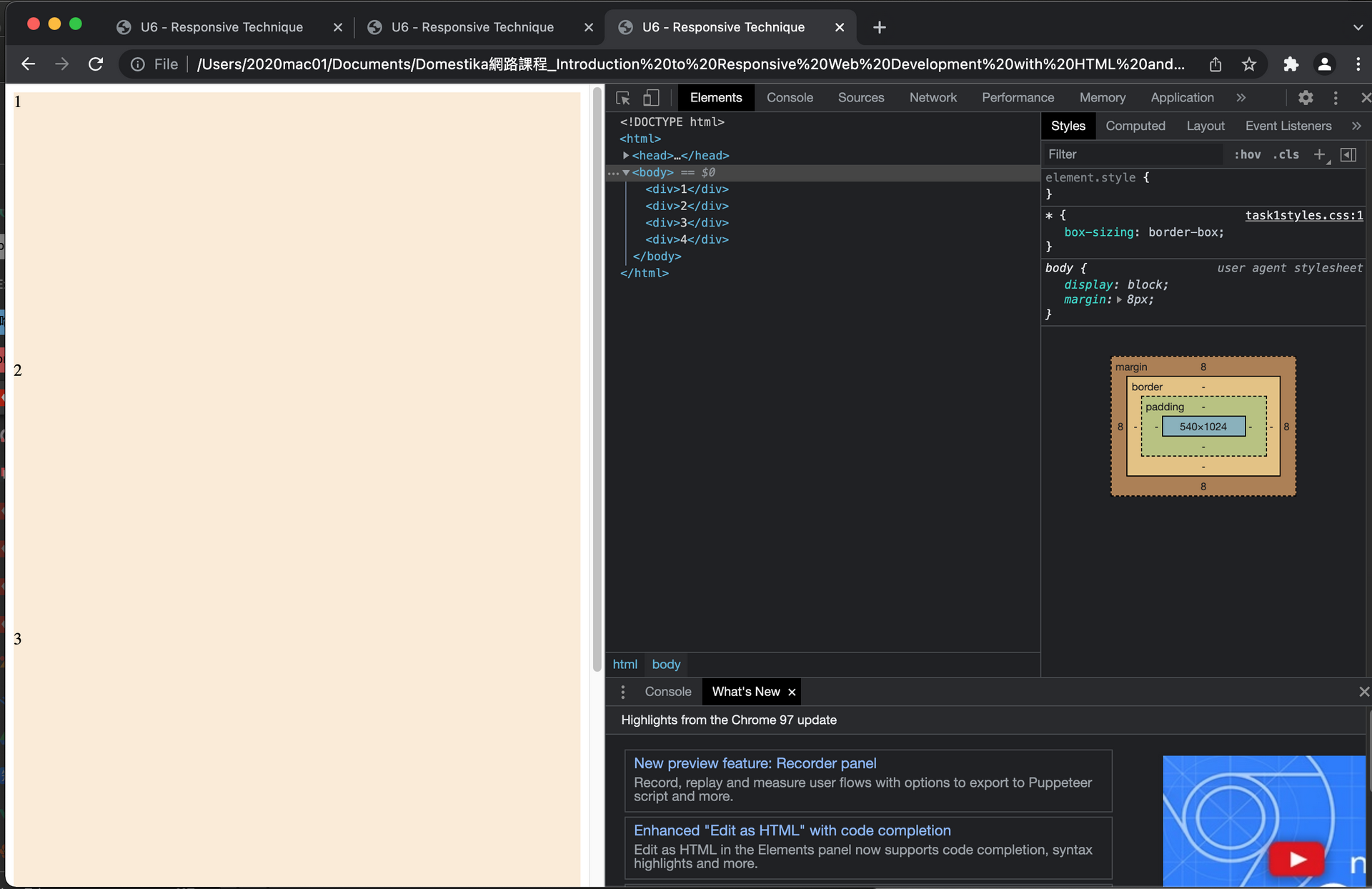
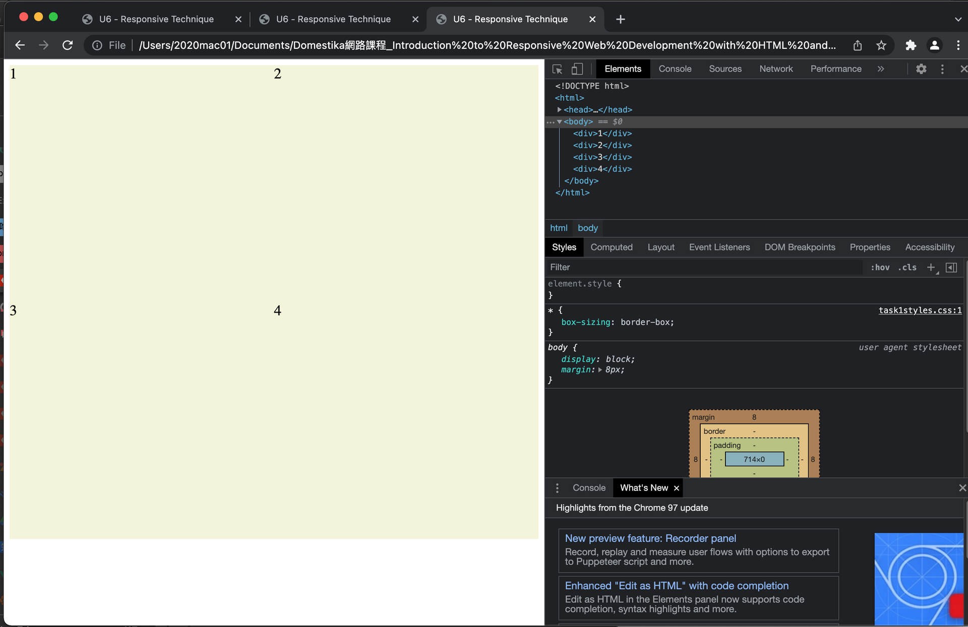
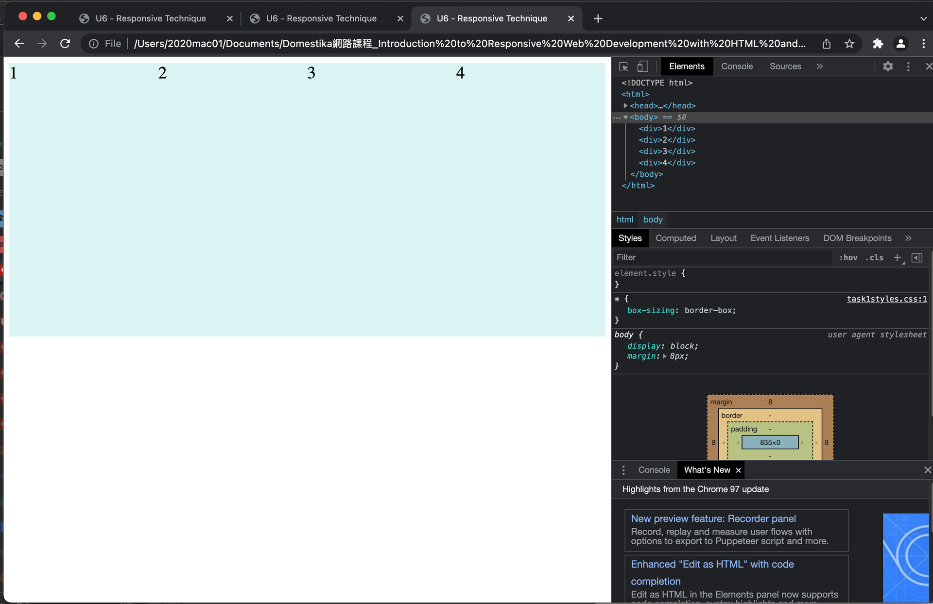
#### Create a responsive structure.
Create a structure of 4 divs with content (fill text) that are one below the other in small screen, and as there is more space, float 2 in two, and then float all 4, in a single row. Use percentage measures and half queries.
```
<!-- html -->
<!DOCTYPE html>
<html>
<head>
<title>U6 - Responsive Technique</title>
<meta charset="utf-8">
<link rel="stylesheet" href="css/task1styles.css">
</head>
<body>
<div>1</div>
<div>2</div>
<div>3</div>
<div>4</div>
</body>
</html>
```
```
/* CSS */
*{
box-sizing: border-box;
}
div{
width: 100%;
height: 16em;
float: none;
background-color: antiquewhite;
}
/* 視窗模式 而且 頁面寬度大於 600px */
@media screen and (min-width: 600px){
div{
width: 50%; /* 寬度一半,可容納兩個div */
float: left;
background-color: #F4F4D9;
font-size: 20px;
}
}
/* 視窗模式 而且 頁面寬度大於 800px */
@media screen and (min-width: 800px){
div{
width: 25%; /* 寬度 1/4 ,可容納 4 個div */
float: left;
font-size: 24px;
background-color: #D9F4F4;
}
}
```
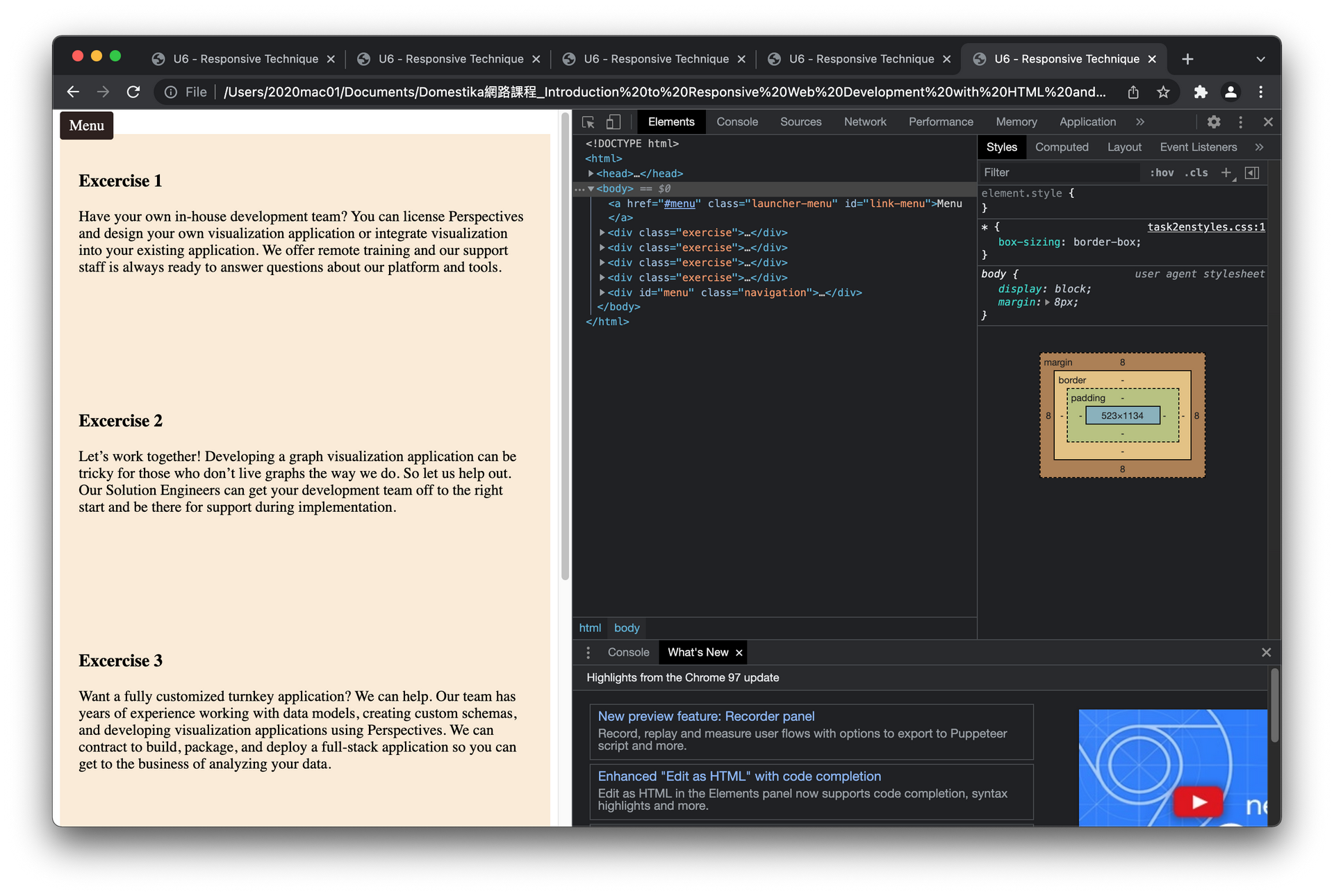
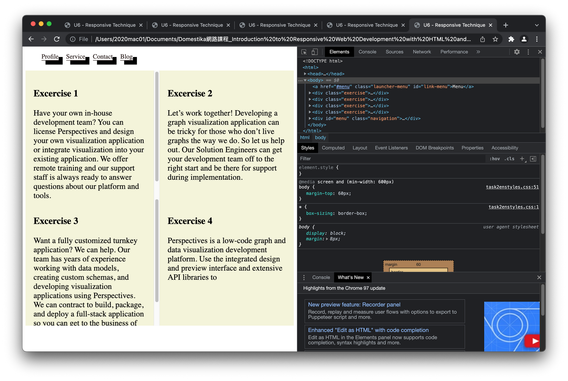
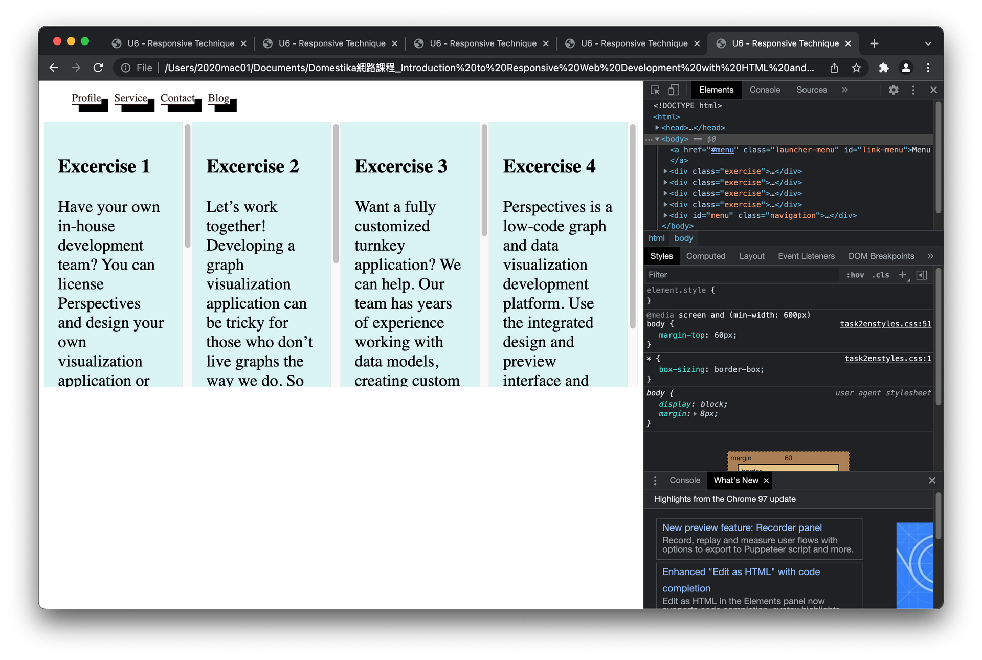
#### Create a responsive navigation.
Try playing the responsive navigation that we have seen.
```
<!-- html -->
<!DOCTYPE html>
<html>
<head>
<title>U6 - Responsive Technique</title>
<meta charset="utf-8">
<link rel="stylesheet" href="css/task2enstyles.css">
</head>
<body>
<a href="#menu" class="launcher-menu" id="link-menu">Menu</a>
<div class="exercise">
<h3>Excercise 1</h3>
<p>Have your own in-house development team? You can license Perspectives and design your own visualization application or integrate visualization into your existing application. We offer remote training and our support staff is always ready to answer questions about our platform and tools.
</p>
</div>
<div class="exercise">
<h3>Excercise 2</h3>
<p>Let’s work together! Developing a graph visualization application can be tricky for those who don’t live graphs the way we do. So let us help out. Our Solution Engineers can get your development team off to the right start and be there for support during implementation.
</p>
</div>
<div class="exercise">
<h3>Excercise 3</h3>
<p>Want a fully customized turnkey application? We can help. Our team has years of experience working with data models, creating custom schemas, and developing visualization applications using Perspectives. We can contract to build, package, and deploy a full-stack application so you can get to the business of analyzing your data.
</p>
</div>
<div class="exercise">
<h3>Excercise 4</h3>
<p>Perspectives is a low-code graph and data visualization development platform. Use the integrated design and preview interface and extensive API libraries to
</p>
</div>
<div id="menu" class="navigation">
<ul>
<li>
<a href="#">Profile</a>
</li>
<li>
<a href="#">Service</a>
</li>
<li>
<a href="#">Contact</a>
</li>
<li>
<a href="#">Blog</a>
</li>
</ul>
</div>
</body>
</html>
```
```
/* CSS */
*{
box-sizing: border-box;
}
.exercise{
width: 100%;
height: 16em;
padding: 20px;
float: none;
overflow:auto;
background-color: antiquewhite;
/*
border-style: dotted;
border-radius:55px;
*/
}
.navigation a{
display: block;
text-decoration: none;
color: #2D211F;
border-bottom: 1px solid #2D211F;
}
.launcher-menu{
text-decoration: none;
color: #FFF;
padding: 6px 10px;
background-color: #2D211F;
border-radius: 3px;
}
@media screen and (min-width: 600px){
.exercise{
width: 50%;
float: left;
background-color: #F4F4D9;
font-size: 20px;
}
/* 隱藏 Menu 按鈕*/
.launcher-menu{
display: none;
}
/* 導覽列移到 body 上方 30px 處 */
.navigation{
position: absolute;
top:0px;
}
/* body這邊空出空間給移到上面的導覽列 */
body{
margin-top: 60px;
}
/* 導覽列列表排成一排相隔一段距離(15px)*/
.navigation li{
display: inline-block;
margin-right: 15px;
box-shadow:10px 10px black;
}
}
@media screen and (min-width: 800px){
.exercise{
width: 25%;
float: left;
font-size: 24px;
background-color: #D9F4F4;
}
}
a:visited{
color: blue;
text-decoration: none;
}
a:hover{
text-decoration: underline;
}
a:active{
color: orange;
}
a:focus{
background-color: lightgray;
}
```


