主題
## Introduction to Responsive Web Development with HTML and CSS - U4 - CSS structure
2021.12.10 11:23
## U4 - CSS structures
---
(這是用Markdown寫的文章,可以全選複製貼到 https://dillinger.io 左側,就能看到正常渲染畫面)
---
===
### CSS Styles and Reset CSS
開啟一個只有 html 架構,沒有任何 CSS 的網頁,並開啟 chrome 瀏覽器的 inspector 模式檢視 CSS style
#### CSS Reset 和 CSS normalize
[Reset.css](https://meyerweb.com/eric/tools/css/reset/)
```
/* Reset.css */
/* CSS */
v2.0 | 20110126
License: none (public domain)
*/
html, body, div, span, applet, object, iframe,
h1, h2, h3, h4, h5, h6, p, blockquote, pre,
a, abbr, acronym, address, big, cite, code,
del, dfn, em, img, ins, kbd, q, s, samp,
small, strike, strong, sub, sup, tt, var,
b, u, i, center,
dl, dt, dd, ol, ul, li,
fieldset, form, label, legend,
table, caption, tbody, tfoot, thead, tr, th, td,
article, aside, canvas, details, embed,
figure, figcaption, footer, header, hgroup,
menu, nav, output, ruby, section, summary,
time, mark, audio, video {
margin: 0;
padding: 0;
border: 0;
font-size: 100%;
font: inherit;
vertical-align: baseline;
}
/* HTML5 display-role reset for older browsers */
article, aside, details, figcaption, figure,
footer, header, hgroup, menu, nav, section {
display: block;
}
body {
line-height: 1;
}
ol, ul {
list-style: none;
}
blockquote, q {
quotes: none;
}
blockquote:before, blockquote:after,
q:before, q:after {
content: '';
content: none;
}
table {
border-collapse: collapse;
border-spacing: 0;
}
```
[normalise.css](https://necolas.github.io/normalize.css/latest/normalize.css)
```
/* normalize.css */
/* CSS */
/*! normalize.css v8.0.1 | MIT License | github.com/necolas/normalize.css */
/* Document
========================================================================== */
/**
* 1. Correct the line height in all browsers.
* 2. Prevent adjustments of font size after orientation changes in iOS.
*/
html {
line-height: 1.15; /* 1 */
-webkit-text-size-adjust: 100%; /* 2 */
}
/* Sections
========================================================================== */
/**
* Remove the margin in all browsers.
*/
body {
margin: 0;
}
/**
* Render the `main` element consistently in IE.
*/
main {
display: block;
}
/**
* Correct the font size and margin on `h1` elements within `section` and
* `article` contexts in Chrome, Firefox, and Safari.
*/
h1 {
font-size: 2em;
margin: 0.67em 0;
}
/* Grouping content
========================================================================== */
/**
* 1. Add the correct box sizing in Firefox.
* 2. Show the overflow in Edge and IE.
*/
hr {
box-sizing: content-box; /* 1 */
height: 0; /* 1 */
overflow: visible; /* 2 */
}
/**
* 1. Correct the inheritance and scaling of font size in all browsers.
* 2. Correct the odd `em` font sizing in all browsers.
*/
pre {
font-family: monospace, monospace; /* 1 */
font-size: 1em; /* 2 */
}
/* Text-level semantics
========================================================================== */
/**
* Remove the gray background on active links in IE 10.
*/
a {
background-color: transparent;
}
/**
* 1. Remove the bottom border in Chrome 57-
* 2. Add the correct text decoration in Chrome, Edge, IE, Opera, and Safari.
*/
abbr[title] {
border-bottom: none; /* 1 */
text-decoration: underline; /* 2 */
text-decoration: underline dotted; /* 2 */
}
/**
* Add the correct font weight in Chrome, Edge, and Safari.
*/
b,
strong {
font-weight: bolder;
}
/**
* 1. Correct the inheritance and scaling of font size in all browsers.
* 2. Correct the odd `em` font sizing in all browsers.
*/
code,
kbd,
samp {
font-family: monospace, monospace; /* 1 */
font-size: 1em; /* 2 */
}
/**
* Add the correct font size in all browsers.
*/
small {
font-size: 80%;
}
/**
* Prevent `sub` and `sup` elements from affecting the line height in
* all browsers.
*/
sub,
sup {
font-size: 75%;
line-height: 0;
position: relative;
vertical-align: baseline;
}
sub {
bottom: -0.25em;
}
sup {
top: -0.5em;
}
/* Embedded content
========================================================================== */
/**
* Remove the border on images inside links in IE 10.
*/
img {
border-style: none;
}
/* Forms
========================================================================== */
/**
* 1. Change the font styles in all browsers.
* 2. Remove the margin in Firefox and Safari.
*/
button,
input,
optgroup,
select,
textarea {
font-family: inherit; /* 1 */
font-size: 100%; /* 1 */
line-height: 1.15; /* 1 */
margin: 0; /* 2 */
}
/**
* Show the overflow in IE.
* 1. Show the overflow in Edge.
*/
button,
input { /* 1 */
overflow: visible;
}
/**
* Remove the inheritance of text transform in Edge, Firefox, and IE.
* 1. Remove the inheritance of text transform in Firefox.
*/
button,
select { /* 1 */
text-transform: none;
}
/**
* Correct the inability to style clickable types in iOS and Safari.
*/
button,
[type="button"],
[type="reset"],
[type="submit"] {
-webkit-appearance: button;
}
/**
* Remove the inner border and padding in Firefox.
*/
button::-moz-focus-inner,
[type="button"]::-moz-focus-inner,
[type="reset"]::-moz-focus-inner,
[type="submit"]::-moz-focus-inner {
border-style: none;
padding: 0;
}
/**
* Restore the focus styles unset by the previous rule.
*/
button:-moz-focusring,
[type="button"]:-moz-focusring,
[type="reset"]:-moz-focusring,
[type="submit"]:-moz-focusring {
outline: 1px dotted ButtonText;
}
/**
* Correct the padding in Firefox.
*/
fieldset {
padding: 0.35em 0.75em 0.625em;
}
/**
* 1. Correct the text wrapping in Edge and IE.
* 2. Correct the color inheritance from `fieldset` elements in IE.
* 3. Remove the padding so developers are not caught out when they zero out
* `fieldset` elements in all browsers.
*/
legend {
box-sizing: border-box; /* 1 */
color: inherit; /* 2 */
display: table; /* 1 */
max-width: 100%; /* 1 */
padding: 0; /* 3 */
white-space: normal; /* 1 */
}
/**
* Add the correct vertical alignment in Chrome, Firefox, and Opera.
*/
progress {
vertical-align: baseline;
}
/**
* Remove the default vertical scrollbar in IE 10+.
*/
textarea {
overflow: auto;
}
/**
* 1. Add the correct box sizing in IE 10.
* 2. Remove the padding in IE 10.
*/
[type="checkbox"],
[type="radio"] {
box-sizing: border-box; /* 1 */
padding: 0; /* 2 */
}
/**
* Correct the cursor style of increment and decrement buttons in Chrome.
*/
[type="number"]::-webkit-inner-spin-button,
[type="number"]::-webkit-outer-spin-button {
height: auto;
}
/**
* 1. Correct the odd appearance in Chrome and Safari.
* 2. Correct the outline style in Safari.
*/
[type="search"] {
-webkit-appearance: textfield; /* 1 */
outline-offset: -2px; /* 2 */
}
/**
* Remove the inner padding in Chrome and Safari on macOS.
*/
[type="search"]::-webkit-search-decoration {
-webkit-appearance: none;
}
/**
* 1. Correct the inability to style clickable types in iOS and Safari.
* 2. Change font properties to `inherit` in Safari.
*/
::-webkit-file-upload-button {
-webkit-appearance: button; /* 1 */
font: inherit; /* 2 */
}
/* Interactive
========================================================================== */
/*
* Add the correct display in Edge, IE 10+, and Firefox.
*/
details {
display: block;
}
/*
* Add the correct display in all browsers.
*/
summary {
display: list-item;
}
/* Misc
========================================================================== */
/**
* Add the correct display in IE 10+.
*/
template {
display: none;
}
/**
* Add the correct display in IE 10.
*/
[hidden] {
display: none;
}
```
轉載參考: [Day21:小事之 CSS Reset 與 CSS normalize](https://ithelp.ithome.com.tw/articles/10196528)
W3C 制定 HTML 與 CSS 規格時,並未強制規定各家瀏覽器怎麼實作每一個 HTML tag 的 CSS 預設樣式,只提供資訊參考的範例,加上 IE 獨佔時期,還沒其他瀏覽器, CSS Reset 的需求主要落在 IE 個版本之間的調整 , 後來 Firefox 、safari、Chrome 出現,網頁設計師必須針對每個瀏覽器去做調整,因此 CSS Reset 的需求漸漸增加 .
##### CSS Reset
CSS Reset 做法是把所有瀏覽器最不一致的地方強制歸 0, 可以看到最一開始那一大串 html tag 的 margin、pading、border、outline 全都設為 0
優點是統整,重置了各個瀏覽器的樣式設定.
缺點是必須全部重新做設定,比較沒有彈性,而且在使用開發者工具時會看到一大坨的繼承鏈(inheritance chain).
因此後來出現了 normalize.css
##### CSS Normalize
因為 reset.css 重置了各個瀏覽器的樣式設定,使得有些有用,常用標籤的默認樣式必須要重新設定,因為這個問題,有人開發出了 normalize.css
在 Normalize.css 的官方頁面上點出了他們的目標
- 保留有用的瀏覽器默認設置,而不是將其刪除
- 為廣泛的 HTML 元素提供一般化的樣式
- 修正瀏覽器的 Bug 與不一致
- 透過微妙的改善提高可用性
- 有詳細的文檔來解釋代碼.(每個樣式都有注解是處理什麼問題)
因此 Normalize.css 被使用在很多 framework 和網站上
最大特色就是保留原本預設 HTML 標籤的樣式,僅針對不同瀏覽器與各版本間不相容的標籤進行微調整.
目前 reset.css 與 normalize.css 都有人使用,可以針對需求擇一使用即可,reset.css 與 normalize.css 不論用哪一套,都是在一開始就要引入網頁,因為他的目的就是在一開始幫你將各瀏覽器之間的差異進行調整.
===
### The box model
在 web 上, 所有的 elements 都是用 box 的方式 display 的, 每個 box 有一系列的 properties: width, height, margin, spacing , edge.
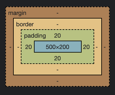
margin: 代表
使用 margin 水平置中(垂直置中比較複雜不能只用 auto 做到)
```
/* CSS */
.example{
margin-left: auto;
margin-right: auto;
}
```
設定 min-width, max-width (height 比照辦理)來對齊所有 box 和 element,讓頁面看起來更一致 (uniform)
```
/* CSS */
div{
min-width: 500px;
max-height: 500px;
}
```
設定 box 上,右,下,左 四邊的 margin
```
/* CSS */
div{
margin-top: 20px;
margin-right: 30px;
margin-bottom: 10px;
margin-left: 15px;
}
```
也可以省略如下,代表上右下左(順時針)四邊,注意順序喔
```
/* CSS */
div{
margin: 20px 30px 10px 15px;
}
```
也可以省略如下,則代表上,下兩邊
```
/* CSS */
div{
margin: 20px 30px;
}
```
也可以省略如下,則代表全部四邊同大小
```
/* CSS */
div{
margin: 20px;
}
```
padding: 代表在 box 裡面的間隔(content內文到border之間).
可以比照上面 margin 的設定邏輯處理
```
/* CSS */
div{
padding-top: 20px;
padding-right: 30px;
padding-bottom: 10px;
padding-left: 15px;
}
```
也可以省略如下
```
/* CSS */
div{
padding: 20px 30px 10px 15px;
}
```
來看一個問題,我們的 example div 的寬度 width 是 500 pixels, 高度 height 是 200 pixels,每邊的 padding 是 20 pixels.
```
/* CSS */
.example{
font-size: 30px;
background-color: #ECECEC;
width: 500px;
height: 200px;
padding: 20px;
}
```
但是當我在 browser 檢視 item 後看到的是, total width 540 pixels,為什麼呢? 這是因為傳統的 box model 裡,
`total width = width + padding + border`
所以 500 px width + 20 px padding per side = 540 px , 這是很常見的問題,但是當我們在響應式內容 ( responsive context ) 使用百分比寬度 ( percentage width ),這就會變成嚴重的問題,
例如,我們想要一個佔據 50% 的 column, 把padding加上去後,就會不知道最後的寬度 width 是多少?
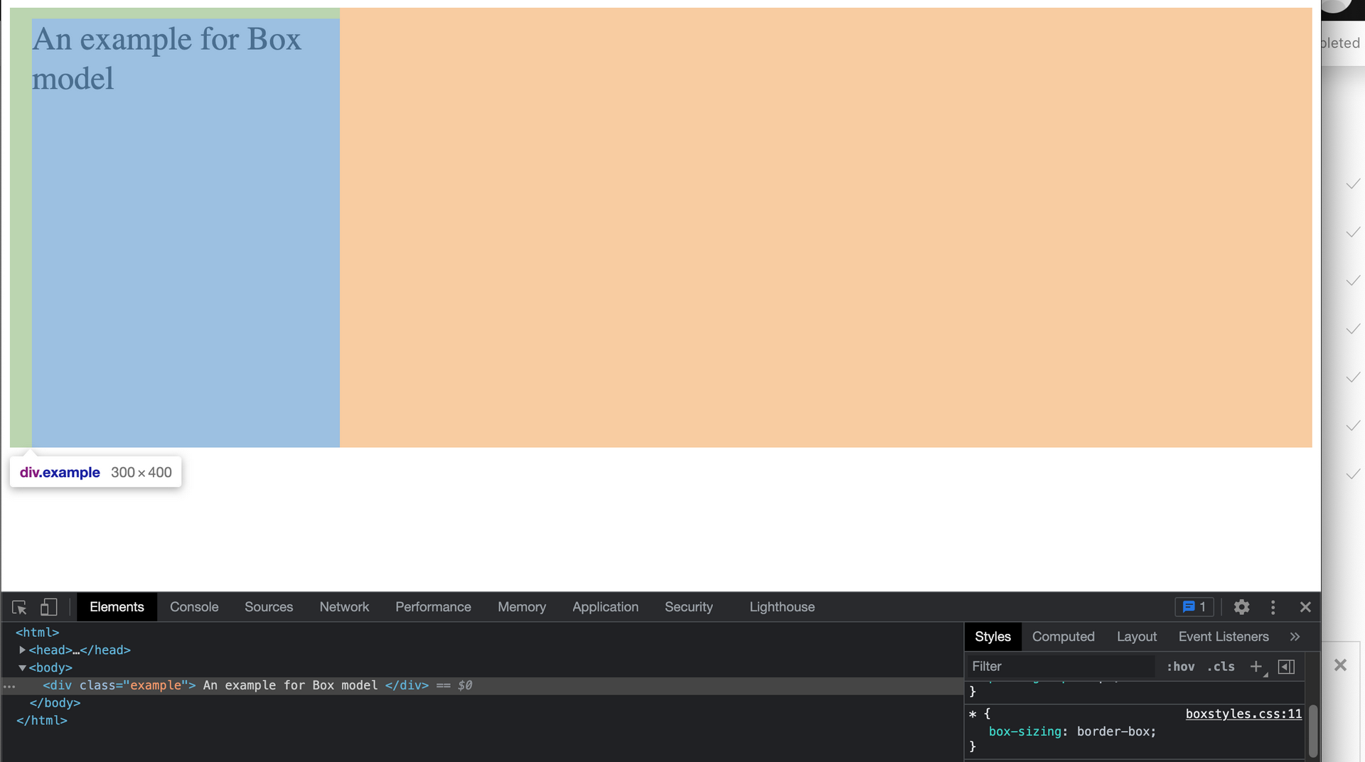
幸運的是,我們可以解決這個問題,藉由 reset box model 的方式
在 CSS 把所有 element 的 box-sizing 設定成 border-box,那麼 box model 的 total width 就會等於 “width” 而不再是 `width + padding + border`
```
/* CSS */
*{
box-sizing: border-box;
}
```
total width = width + padding + border
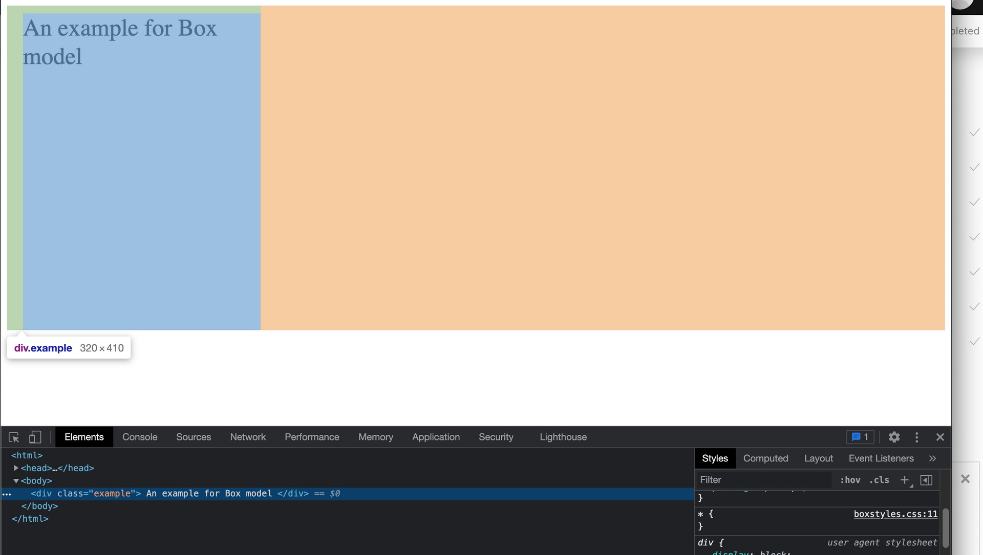
加上屬性
`box-sizing: border-box`, total width = width
===
### Displays
display 這個 property 可以讓我們修改 element 在 browser 上顯示的樣式
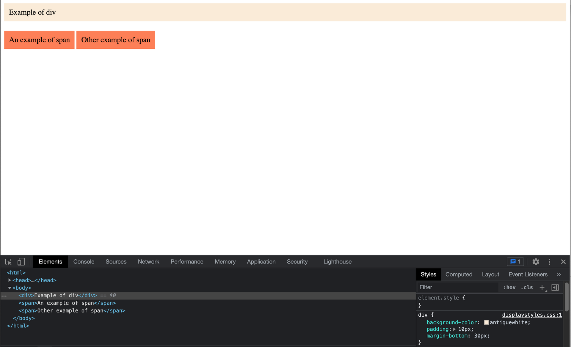
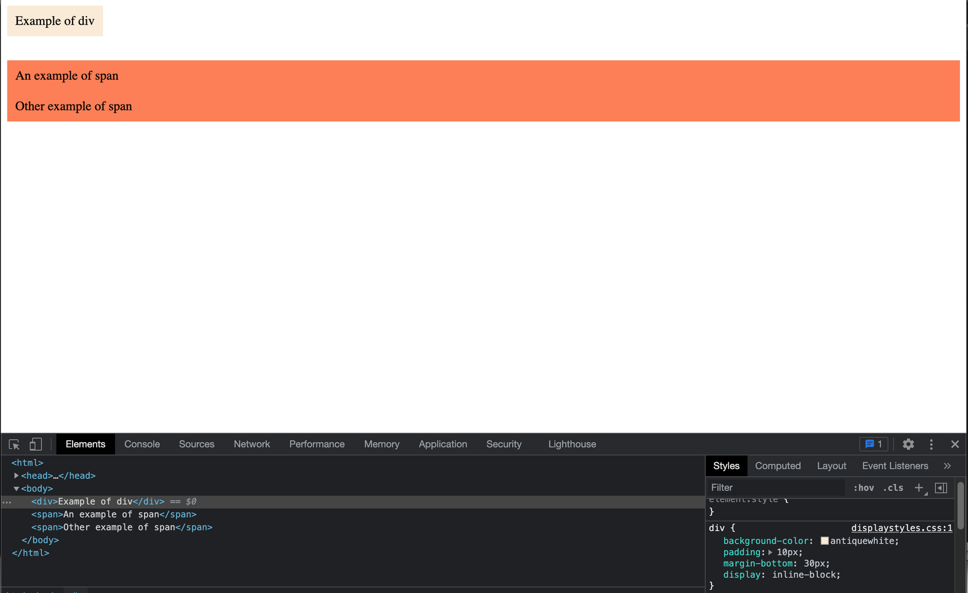
舉個例子.
@ div block 和 兩個 span line
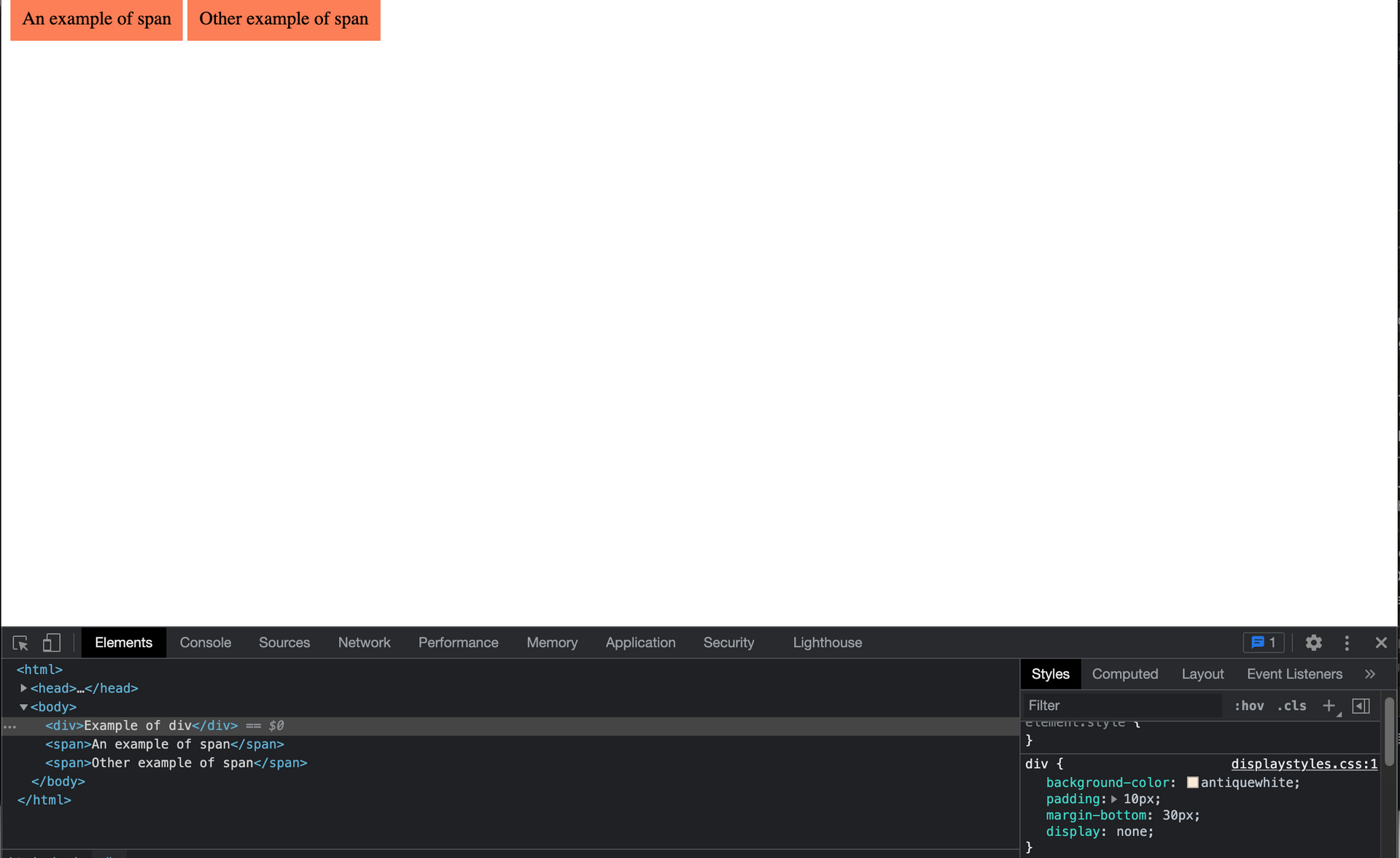
display:none 可以隱藏 element
```
/* CSS */
div{
display:none;
}
```
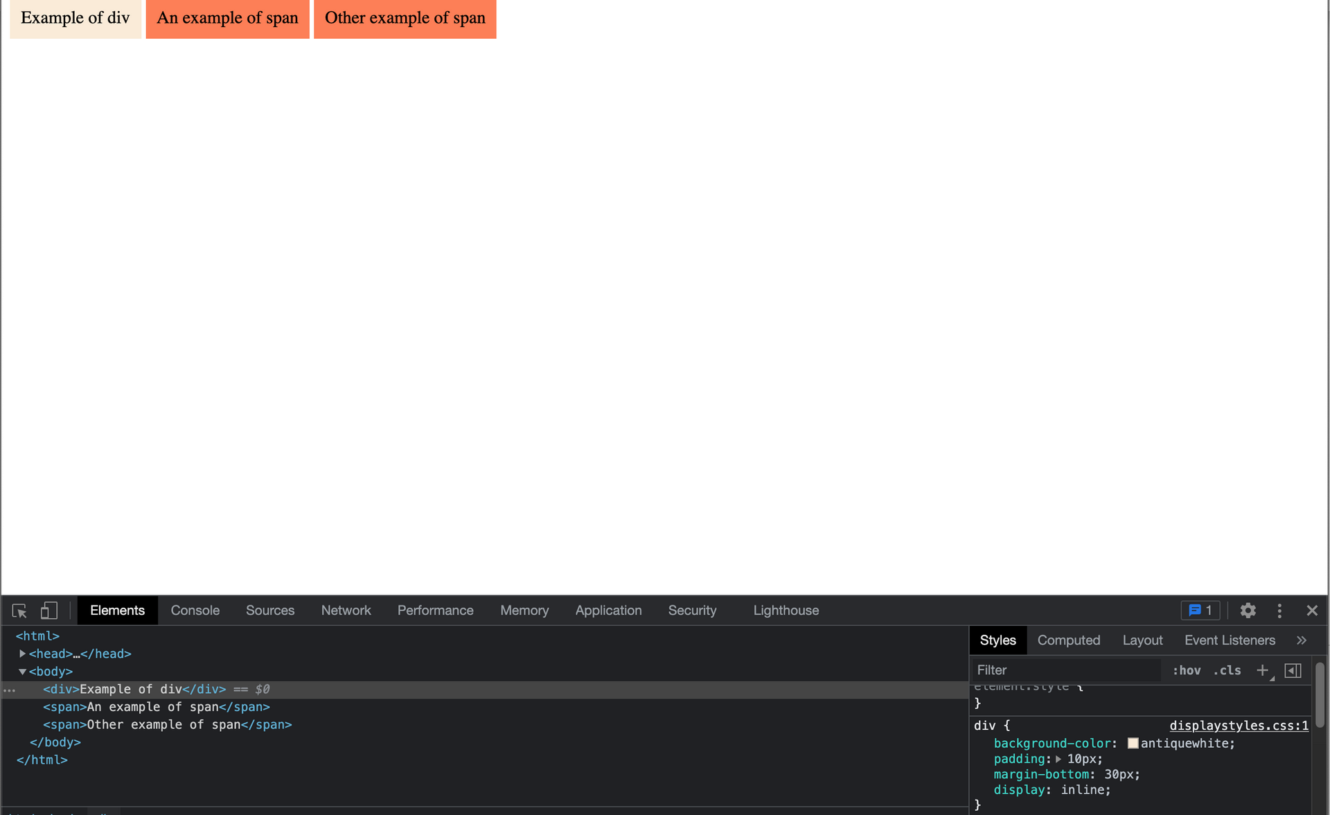
display: inline 可以讓 block element 表現得像 line element, 這邊的 div 這個 block element 變成沒有 line break 的 line element 一樣
```
/* CSS */
div{
display: inline;
}
```
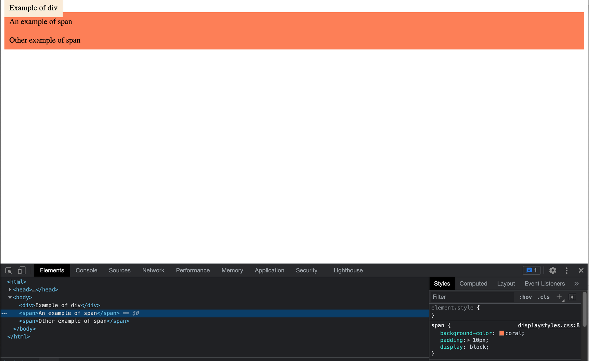
display: block 可以讓 line element 表現得像 block element , 這邊把原來的 span 這個 line element 變成像 block element 的行為, 後面有 line break
```
/* CSS */
span{
display: block;
}
```
可以看到,剛剛 div 設成 `display:inline;` 所以 line element 的行為會有重疊 ( overlap ) 的情況發生,可以用 `display:inline-block` 解決
display:inline-block 會表現得像 line element 但是不會造成 line break, 而且會保有一些 block 特性,像是 top 和 bottom margin 或 height
```
/* CSS */
span{
display: inline-block;
}
```
===
### Floats
#### float
float 這個 property(屬性) 可以用來做出 reticle (分劃版) 效果像是 grid,可以讓兩個 block 並肩放在一起,而沒有 line break (換行).
但是有 float 屬性的 block 和 沒有 float 屬性的 block 搭配的不太相容,有必要用其他技術做處理,下面會說明.
#### overflow 屬性
之前提到在 div block 會設定區塊高度 `height: 200px;` ,如果文章過長就會跑出區塊
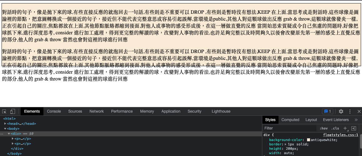
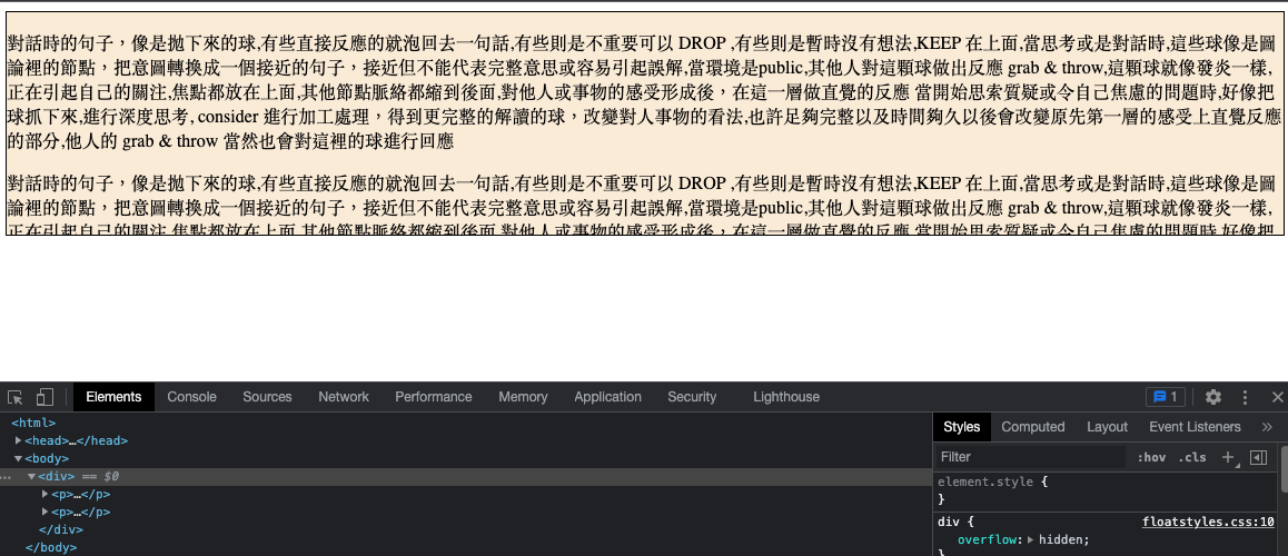
##### overflow: hidden
這裡可以使用 overflow: hidden 屬性來處理,讓超出 container 的 content (內容) 隱藏
```
/* CSS */
div{
overflow: hidden;
}
```
隱藏超出區塊的內容
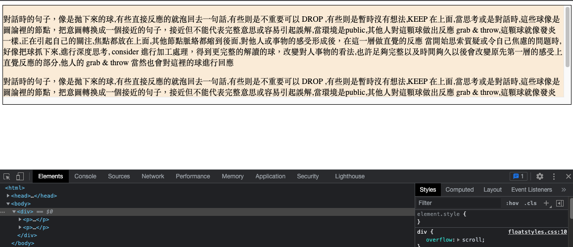
##### overflow: scroll
可以讓超出 container 區塊的內容,多出 scroll 捲軸來看完整內容.
```
/* CSS */
div{
overflow: scroll;
}
```
用scroll捲軸顯示超出區塊的內容
##### overflow: auto
讓 browser 決定,內文超過區塊時自動使用 scroll,行為和 overflow: scroll 差不多.
```
/* CSS */
div{
overflow: auto;
}
```
##### overflow: visible
reset 回預設顯示(超出區塊仍會顯示)
```
/* CSS */
div{
overflow: visible;
}
```
#### float
overflow 可以搭配 float 屬性使用
兩個 div 區塊
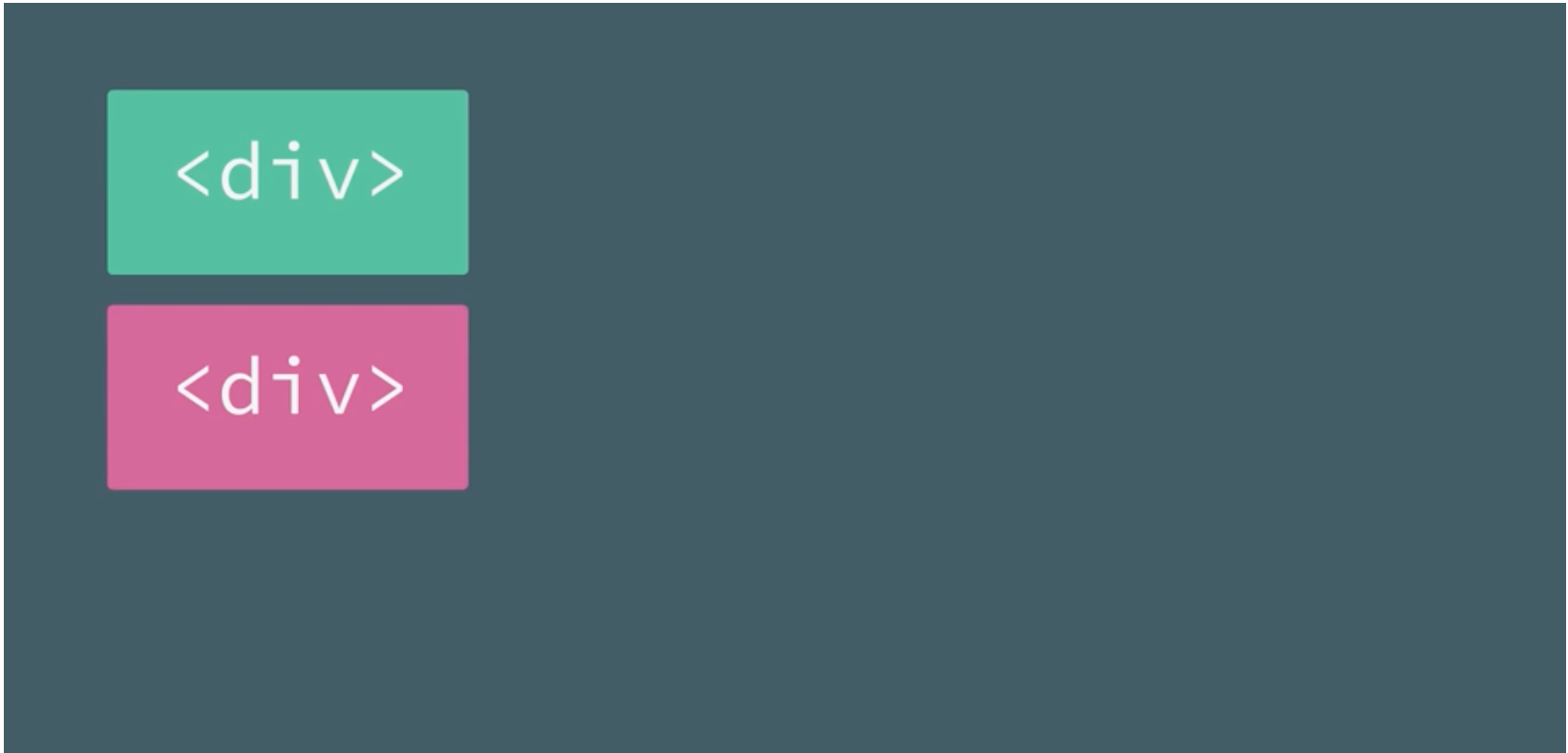
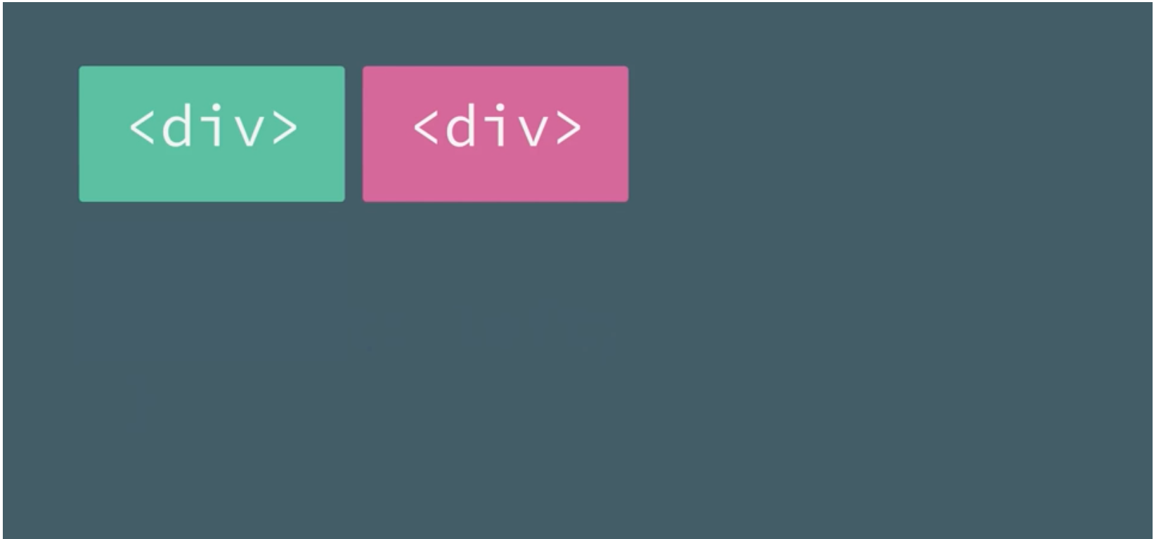
##### float: left
讓區塊並排靠左
```
/* CSS */
div{
float: left;
}
```
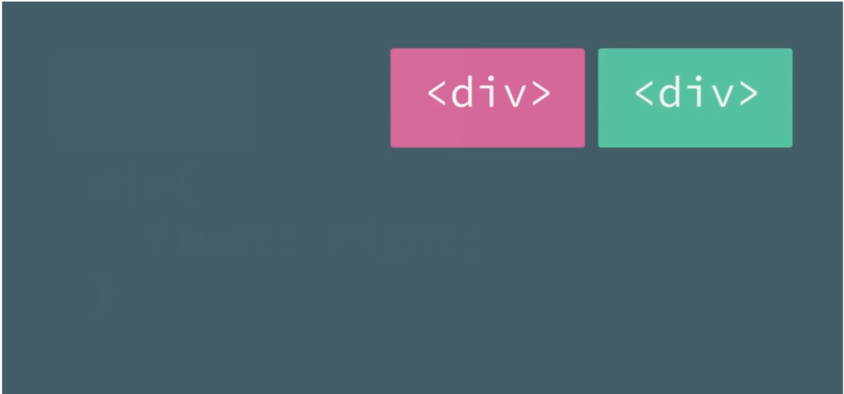
##### float: right
讓區塊並排靠右
```
/* CSS */
div{
float: right;
}
```
##### float: none
reset 回不作變更
```
/* CSS */
div{
float: none;
}
```
###### float: left 的實例
```
<!-- html -->
<div>
<p class="paragraph">...</p>
<p class="paragraph">...</p>
</div>
```
```
/* CSS */
.paragraph {
float: left;
width: 50%;
}
```
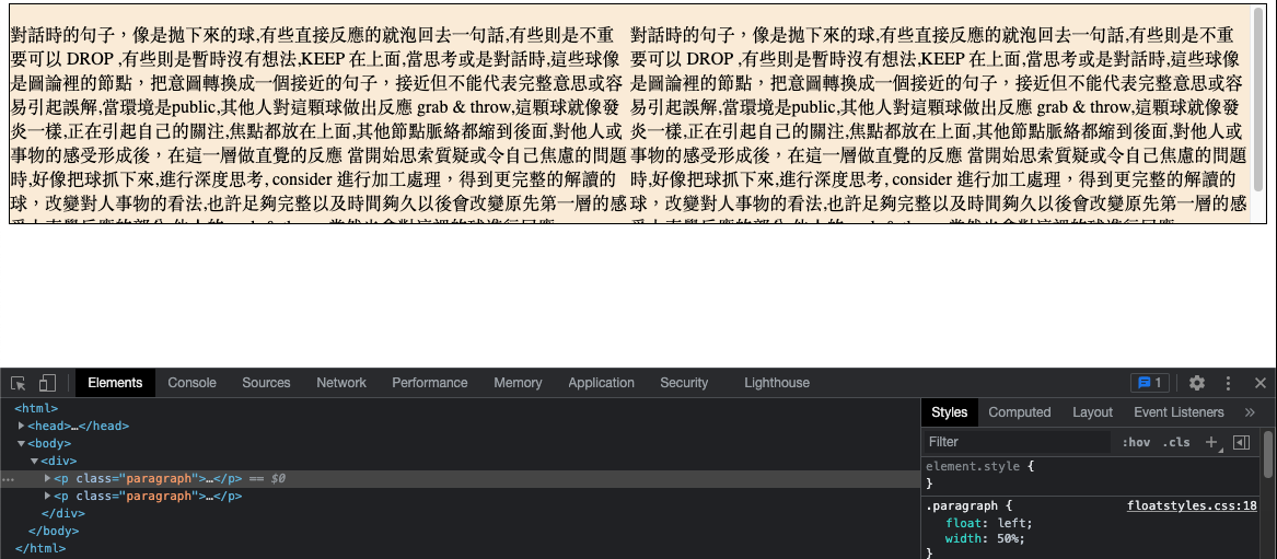
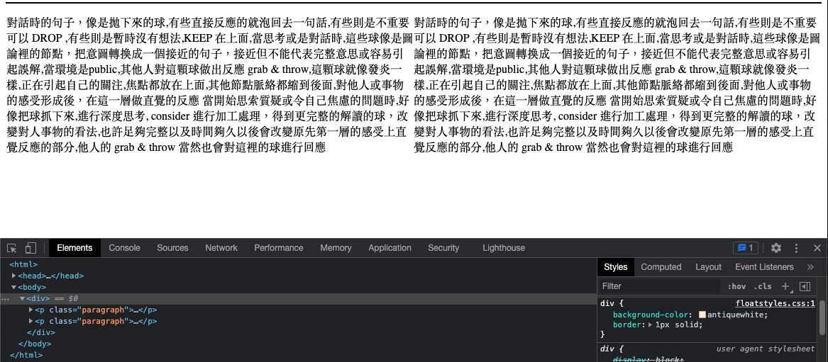
但是這裡有個問題,當這左右兩個 div container 設定成 float 時,不會有換行效果 ( line break ) , container 已經 collapse
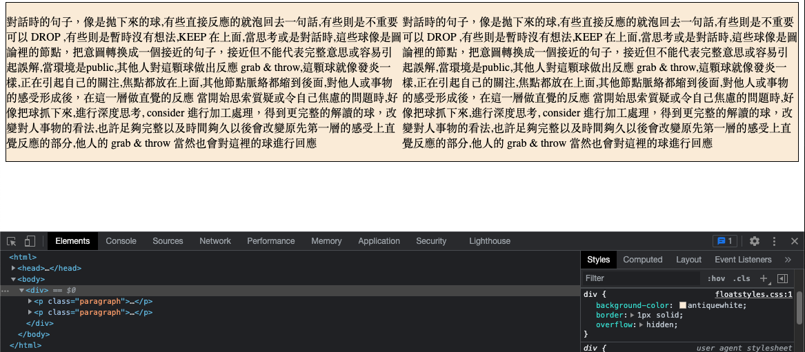
要解決這個問題, 需要讓 float 的 element 被包含進來 ( contained ) ,並且不要影響到其他的結構 ( structure ) ,所以可以做 clean the float, 最簡單的方式達成 clean floats,是讓 wrapper (包裹在外層) 的 div container 設定成 `overflow: hidden;` 屬性, 這樣就會延展到整個內容的最尾巴,完整呈現.
@ float , 還沒設定 overflow: hidden;
@ float , 設定 overflow: hidden;
===
### Position
例子.
```
<!-- html -->
<div>
<p>...</p>
<span>...</span>
</div>
```
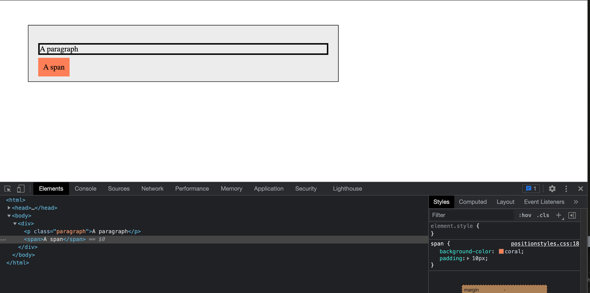
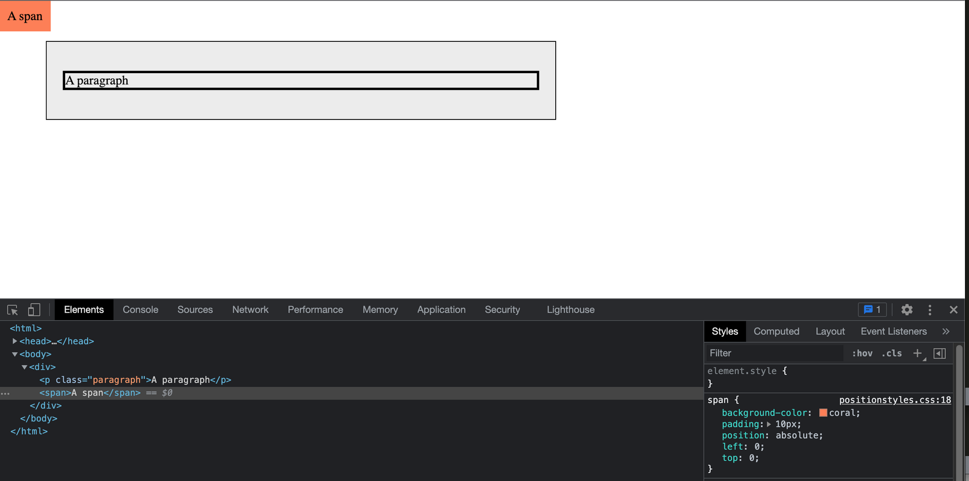
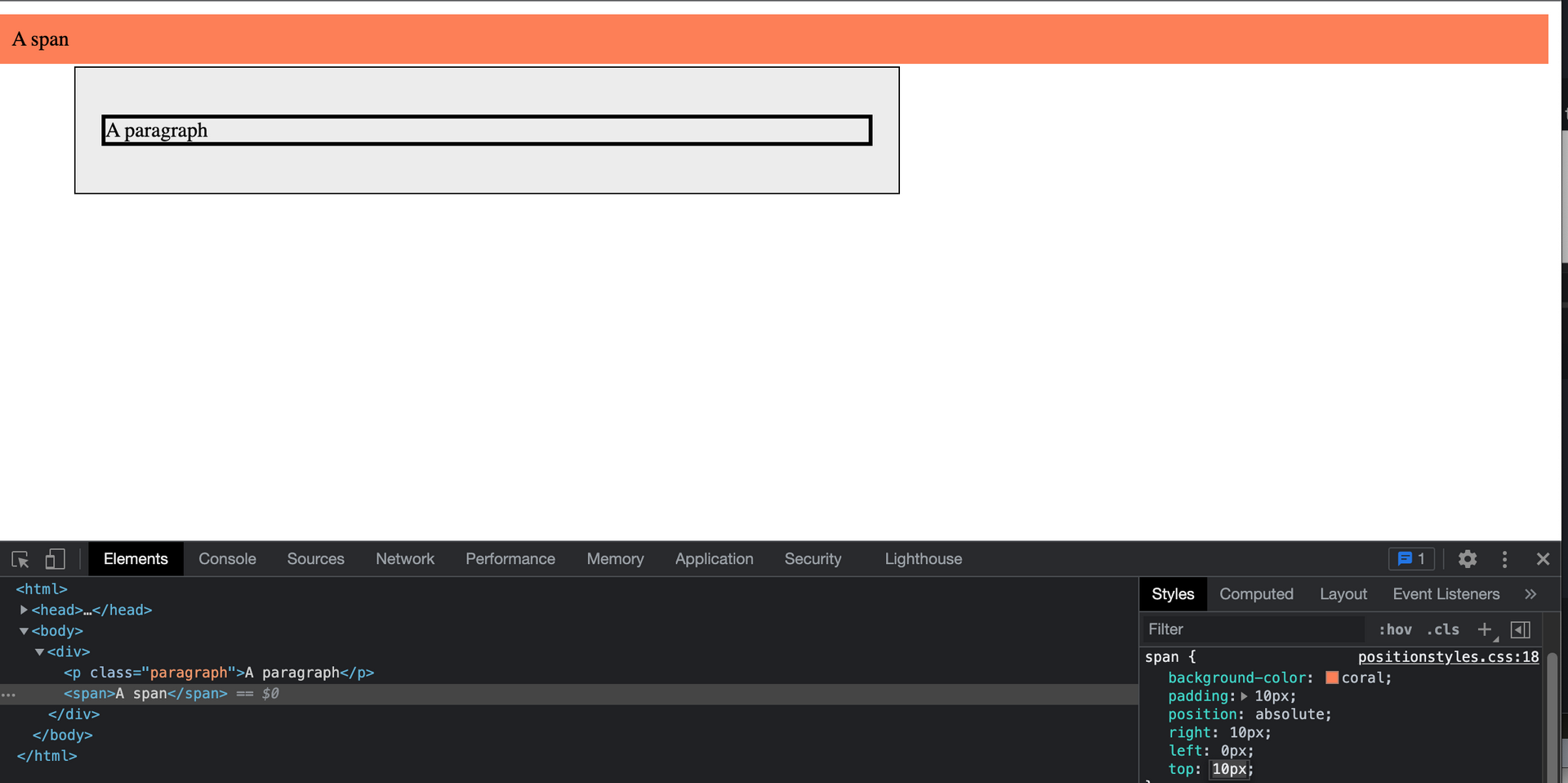
#### position: absolute;
使用 `position: absolute` 搭配 top, bottom, left, right 調整 element 到視窗上的特定位置,或者 expand 到整個視窗
```
/* CSS */
span{
position: absolute;
left: 0px;
top: 0px;
}
```
@ 使用 `position: absolute` 搭配 top、left
```
/* CSS */
span{
position: absolute;
left: 0px;
right: 10px
top: 0px;
}
```
@ 使用搭配 right、left (或 top、bottom) 達到 expand 效果
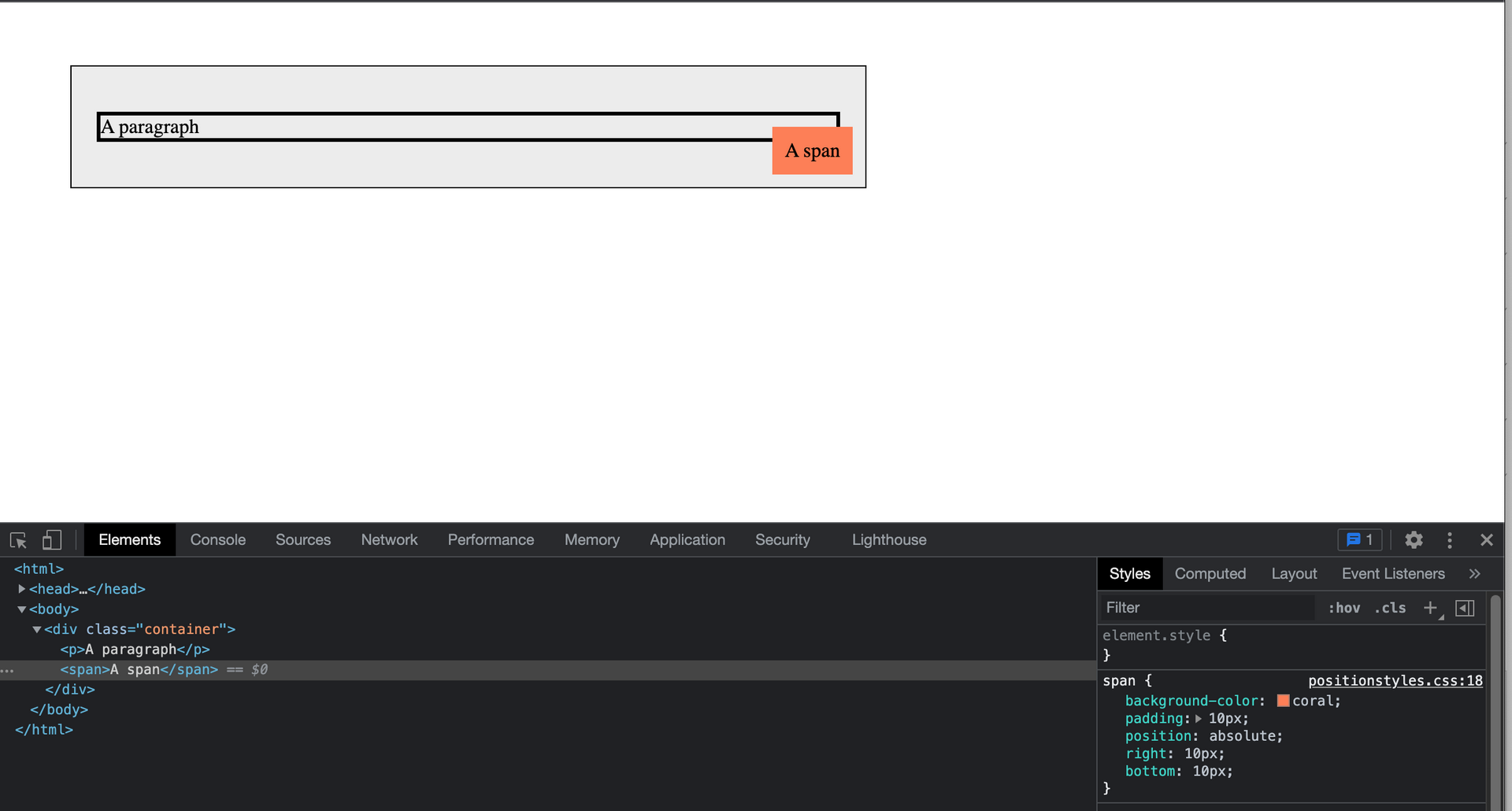
#### position: relative;
使用 `position: relative;` 來調整 element 到相對於特定 element 的位置
舉例如下,span 的 container (這裡是div) 擁有屬性 `position: relative`, 會使得 span 用 container 當作參考 (reference),而不再是以 browser 當參考
```
/* CSS */
.container{
position: relative;
}
span{
position: absolute;
left: 0px;
top: 0px;
}
```
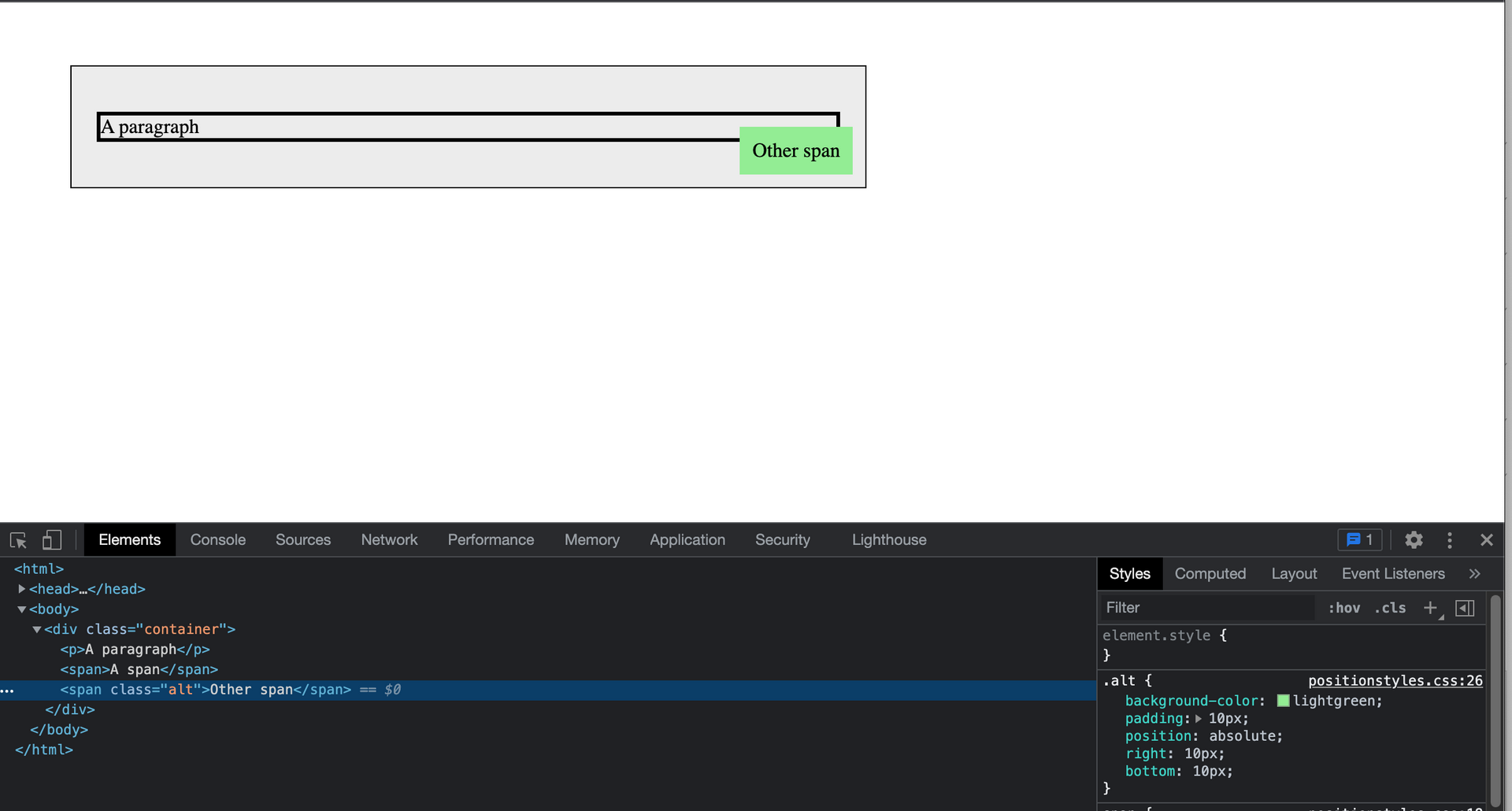
#### z-index
元件重疊時,使用 z-index 決定 element 的前後位置(用z軸突出螢幕的視角來決定元件在哪一層)
舉個例子,前面的例子再新增一個 span在相同位置,結果是如何? 結果會覆蓋到第一個 span (發生 overlapping)
```
<!-- html -->
<div>
<p>...</p>
<span>...</span>
<span class="alt">...</span>
</div>
```
```
/* CSS */
.container{
position: relative;
}
span {
background-color: coral;
padding: 10px;
position: absolute;
right: 10px;
bottom: 10px;
}
.alt{
background-color: lightgreen;
padding: 10px;
position: absolute;
right: 10px;
bottom: 10px;
}
```
@ 新增一個 span在相同位置,第一個 span 被覆蓋(發生 overlapping)
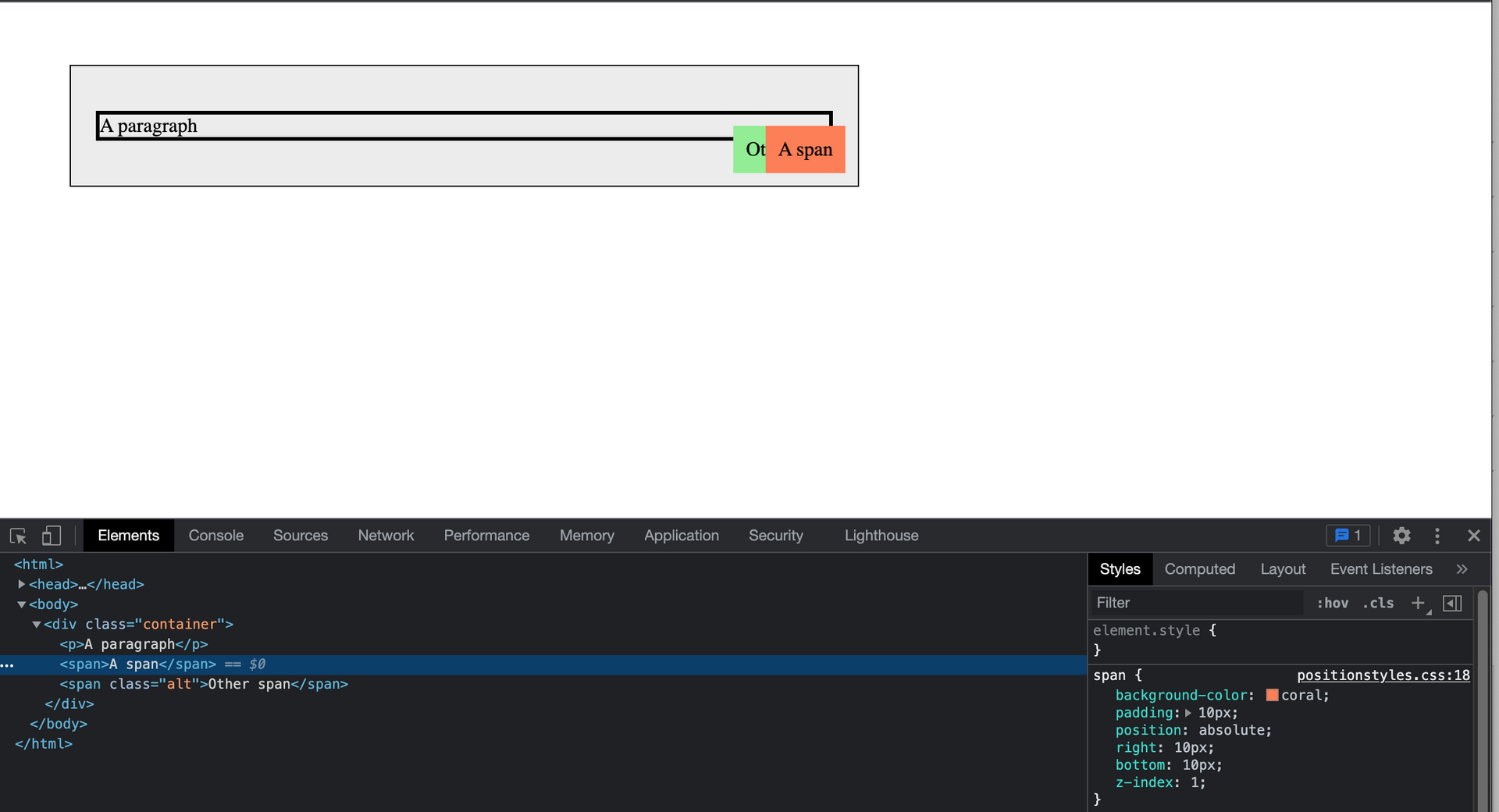
解決的方法是在加上屬性 z-index,大部分的元件 z-index 慣例會設 "z-index: 0"為最底層,所以如果要不被覆蓋數字就要比 “0” 大,所以這裡可以把不想被覆蓋的 span 設成 “z-index: 1” 就不會被覆蓋了
```
/* CSS */
span {
background-color: coral;
padding: 10px;
position: absolute;
right: 10px;
bottom: 10px;
z-index: 1;
}
.alt{
background-color: lightgreen;
padding: 10px;
position: absolute;
right: 10px;
bottom: 10px;
z-index: 0
```
===
### 作業 Task
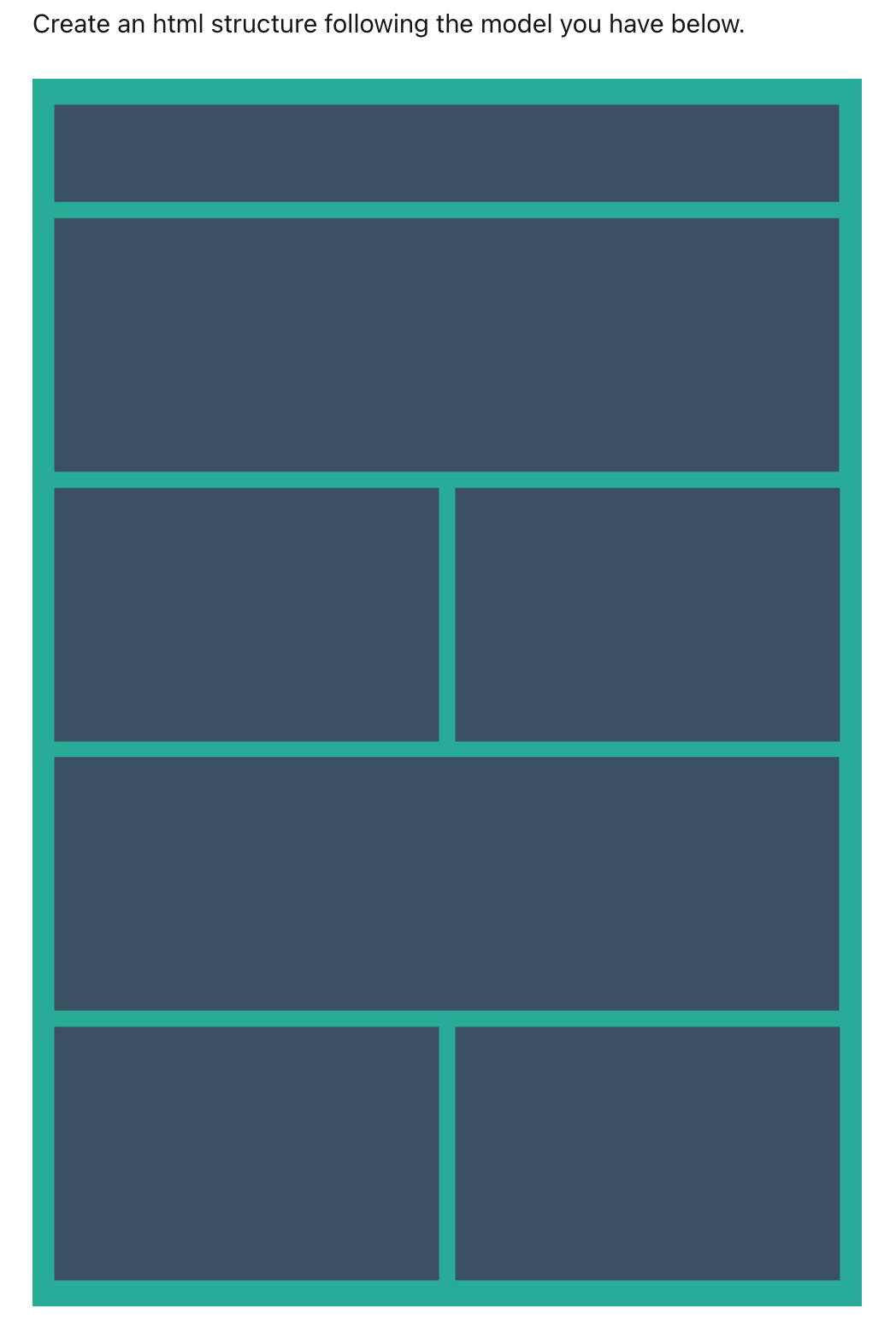
參考: [ w3school- css ](https://www.w3school.com.cn/css/index.asp)
[ColorPicker (Chrome外掛) for right color ](https://www.design-hu.com.tw/webmaster-tools/colorzilla-chrome-extensions.html)
"overflow:hidden;" for div 5 and div 6 overlapping
height percent for space adjusting
總程式碼
```
<!-- html -->
<html>
<head>
<title>U4 - Css Structure - task: Create an HTML structure</title>
<link rel="stylesheet" href="css/taskstyles.css">
</head>
<body>
<div class="container">
<div class="heading">1</div>
<div>2</div>
<div class="floating">3</div><div class="floating">4</div>
<div>5</div>
<div class="floating">6</div><div class="floating">7</div>
</div>
</body>
</html>
```
```
/* CSS */
.container{
padding:0px;
background-color: #3A5162;
border-style: solid;
border-width: 10px;
border-color: #1DAC97;
height: 100%;
}
.heading{
font-size: 30px;
/*background-color: #ECECEC;*/
color:darkgreen;
padding: 0px;
float:none;
height: 12%;
}
div{
font-size: 30px;
/*background-color: #ECECEC;*/
color:darkgreen;
padding: 0px;
float:none;
border-style:solid;
border-color: #1DAC97;
overflow:hidden;
height:22%;
}
.floating{
font-size: 30px;
/*background-color: #ECECEC;*/
color:darkgreen;
width: 50%;
padding: 0px;
float:left;
display:inline-block;
height: 22%;
}
*{
box-sizing: border-box;
}
```


