主題
Introduction to Responsive Web Development with HTML and CSS - U5 - Decoration in CSS
---
(這是用Markdown寫的文章,可以全選複製貼到 https://dillinger.io 左側,就能看到正常渲染畫面)
---
ref: [Introduction to Responsive Web Development with HTML and CSS - U5 - Decoration in CSS](https://www.domestika.org/en/courses/74-introduction-to-responsive-web-development-with-html-and-css/units/323-decoration-in-css)
===
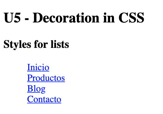
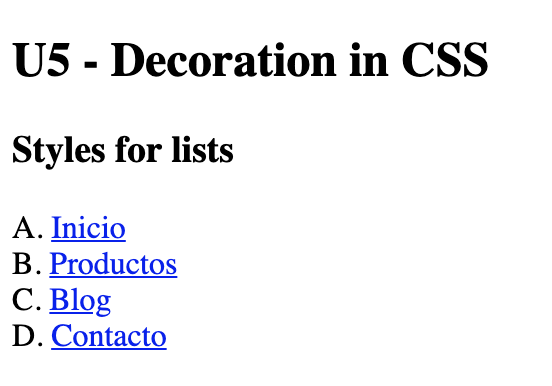
### Styles for lists
[Introduction to Responsive Web Development with HTML and CSS -U2](https://raw.githubusercontent.com/Cssmiley/trello_joplin_calendar_blog/main/uPic/cf30865948a5453985307137a27c0068)前面課程使用過 list 這個 block element,當作 navigation link 列表,這裡會學到改變 list 的樣式.
```
<!--html-->
<ul>
<li><a href="...">Inicio</a></li>
<li><a href="...">Productos</a></li>
<li><a href="...">Blog</a></li>
<li><a href="...">Contacto</a></li>
</ul>
```
#### list-style-type
##### `list-style-type: none`顯示成沒有列點(Bullets)的樣式
```
/* CSS */
ul{
list-style-type: none;
}
```
#### `list-style-type: disc`顯示成圓形列點

##### `list-style-type: square`顯示成方形列點
```
/* CSS */
ul{
list-style-type: square;
}
```

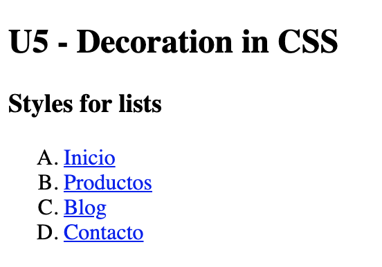
##### `list-style-type: upper-latin`顯示成大寫英文列點
```
/* CSS */
ul{
list-style-type: upper-latin;
}
```

#### list-style-position
可以決定列點的渲染顯示 (Render) 位置
##### `list-style-position: outside` 是渲染位置預設值,預設是outside
```
/* CSS */
ul{
list-style-position: outside;
}
```
##### `list-style-position: inside` 渲染顯示 (Render) 位置在inside
```
/* CSS */
ul{
list-style-position: inside;
}
```
list-style-position: inside 會多出 padding,如果不使用 Reset CSS,可以新增 `padding-left: 0;` 移除左側 padding
```
/* CSS */
ul{
list-style-position: inside;
padding-left: 0;
}
```
===
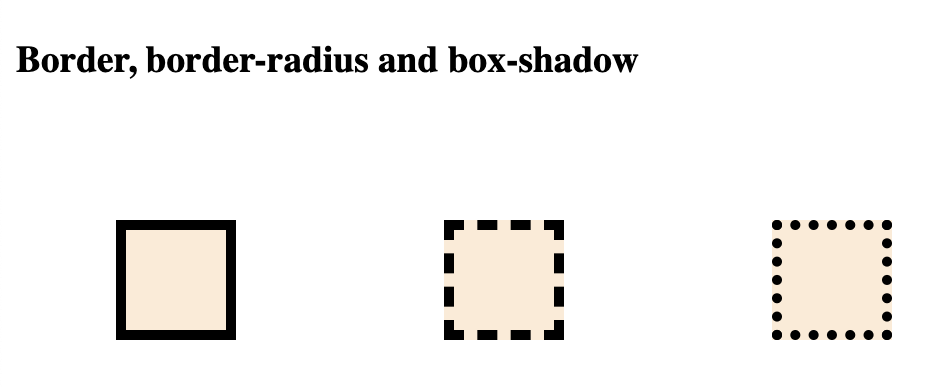
### Border, border-radius and box-shadow
改變 box 的邊角 (edge) 可以為我們的 box 添加個性(personality),而陰影(shadow) 可以提供更多的裝飾.
#### border
在 CSS 裡有三個屬性可以用來定義 box 的 border: `border-width`、`border-style`、`border-color`
##### border-width 設定 border 的寬度 width
##### border-style 設定 border 的 type
##### border-color 設定 border 的 color
```
/*CSS*/
.box {
border-width: 5px;
border-style: solid;
border-color: #389F85;
}
```
上面這些 border 的屬性可以省略如下
```
/*CSS*/
.box {
border-width: 5px solid #389F85;
}
```
舉個例子.
```
<!-- html -->
<div class="border1"></div>
<div class="border2"></div>
<div class="border3"></div>
```
```
/* CSS */
div{
background-color: antiquewhite;
width: 50px;
height: 50px;
margin: 50px;
display: inline-block;
}
.border1{
border: 5px solid black;
}
.border2{
border: 5px dashed black;
}
.border3{
border: 5px dotted black;
}
```
而一個 box 有 4 個邊,可以把上面屬性拆成 4 邊如下 border-width 拆成 top、right、bottom、left (border-style 和 border-color 可以比照辦理)
```
/*CSS*/
.box {
border-top-width: 5px;
border-right-width: 10px;
borde-bottom-width: 5px;
border-left-width: 2px;
}
```
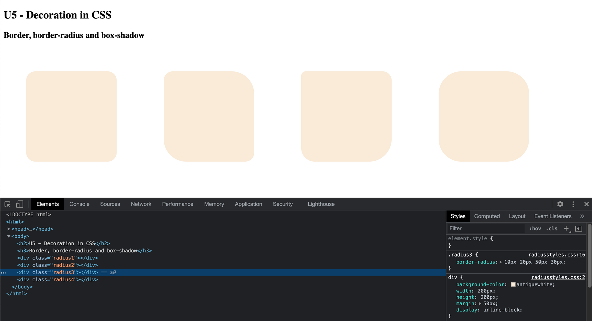
##### border-radius 可以改變 box 的圓角 (rounded cornors)
```
/*CSS*/
.box {
border-radius: 20px;
}
```
分別設定四個圓角
```
/*CSS*/
.box {
border-radius: 10px 15px 20px 50px;
}
```
上面的 CSS 相當於下面順時針的四個圓角屬性分配
```
/*CSS*/
.box {
border-top-left-radius: 10px;
border-top-right-radius: 15px;
border-bottom-right-radius:20px;
border-bottom-left-radius: 50px;
}
```
舉個例子.
```
<!-- html -->
<div class="radius1"></div>
<div class="radius2"></div>
<div class="radius3"></div>
<div class="radius4"></div>
```
```
/* CSS */
div{
background-color: antiquewhite;
width: 200px;
height: 200px;
margin: 50px;
display: inline-block;
}
.radius1{
border-radius: 20px;
}
.radius2{
border-radius: 20px 50px;
}
.radius3{
border-radius: 10px 20px 50px 30px;
}
.radius4{
border-radius: 50px;
}
```
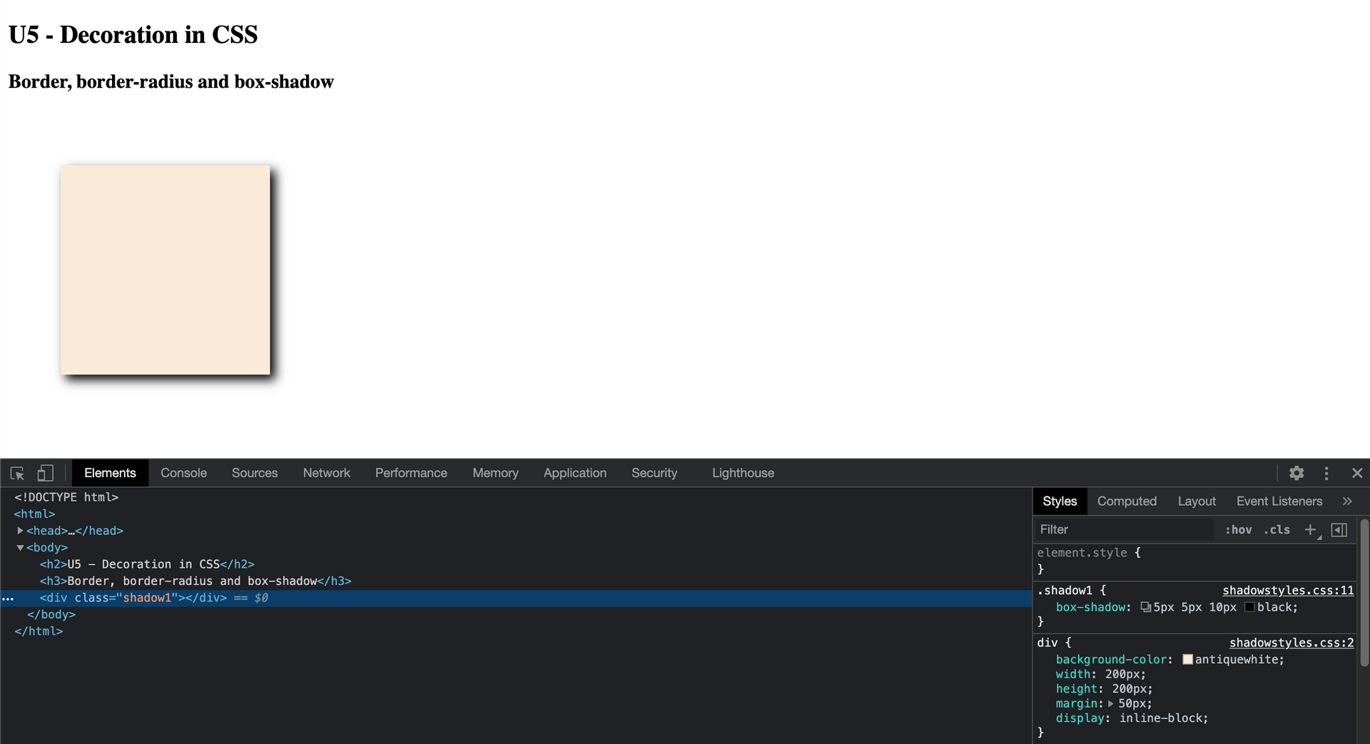
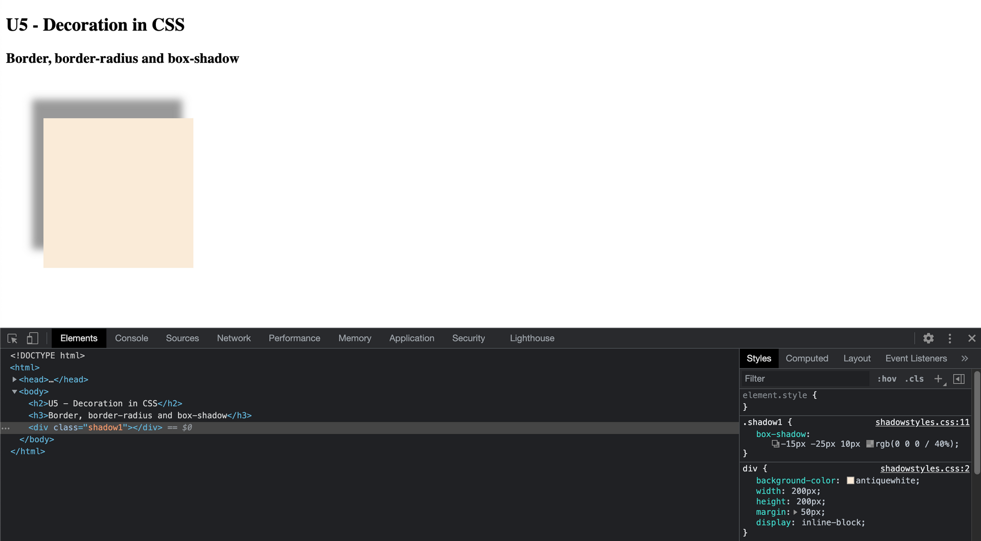
##### box-shadow 可以為 box 增加陰影
如下是設定陰影: 5px 在 x 軸往右 ( x axis ), 5px 在 y 軸往下, 10px 的(模糊暈染)blur,黑色
```
/* CSS */
.box{
/*X Y blur color */
box-shadow: 5px 5px 10px black;
}
```
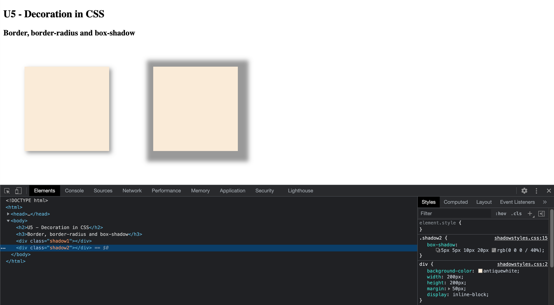
X軸可以是負值,代表陰影往左,Y軸也可以是負值,代表陰影往上
blur數字越大,暈染越多,"0"則表示無暈染,陰影是solid
color的屬性可以用 rgba 設定有透明度的顏色
```
/* CSS */
.box{
/*X Y blur color */
box-shadow: -15px -25px 10px rgba(0, 0, 0, .4);
}
```
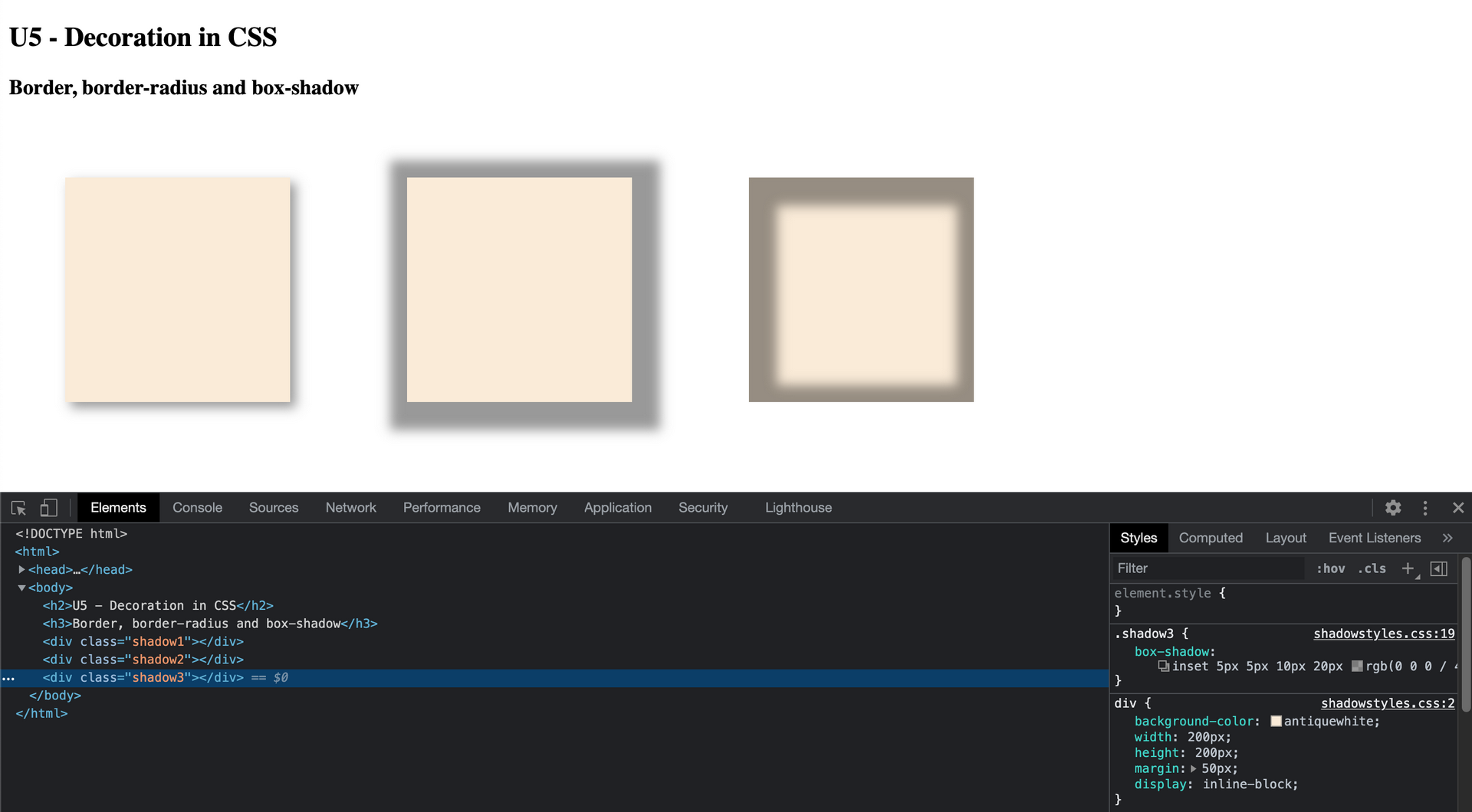
box-shadow 也可以增加一個 spacing,讓陰影更擴張
```
/* CSS */
.box{
/*X Y blur spacing color */
box-shadow: 5px 5px 10px 20px rgba(0, 0, 0, .4);
}
```
box-shadow也可以再加上一個 inset 屬性,讓陰影調整成往 box 內側陰影
```
/* CSS */
.box{
/*inset X Y blur spacing color */
box-shadow: inset 5px 5px 10px 20px rgba(0, 0, 0, .4);
}
```
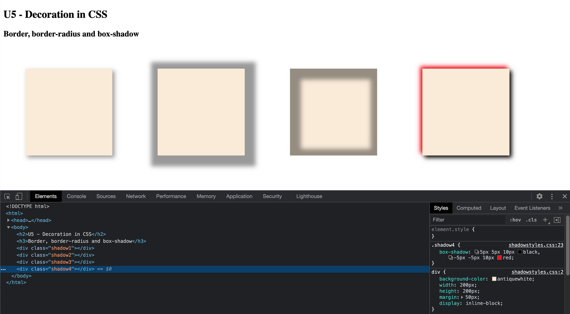
box-shadow 還有一個有趣的地方, 就是可以為同一個 element 宣告多個陰影
```
/* CSS */
.box{
/*X Y blur color */
box-shadow: 5px 5px 10px black,
-5px -5px 10px red;
}
```
===
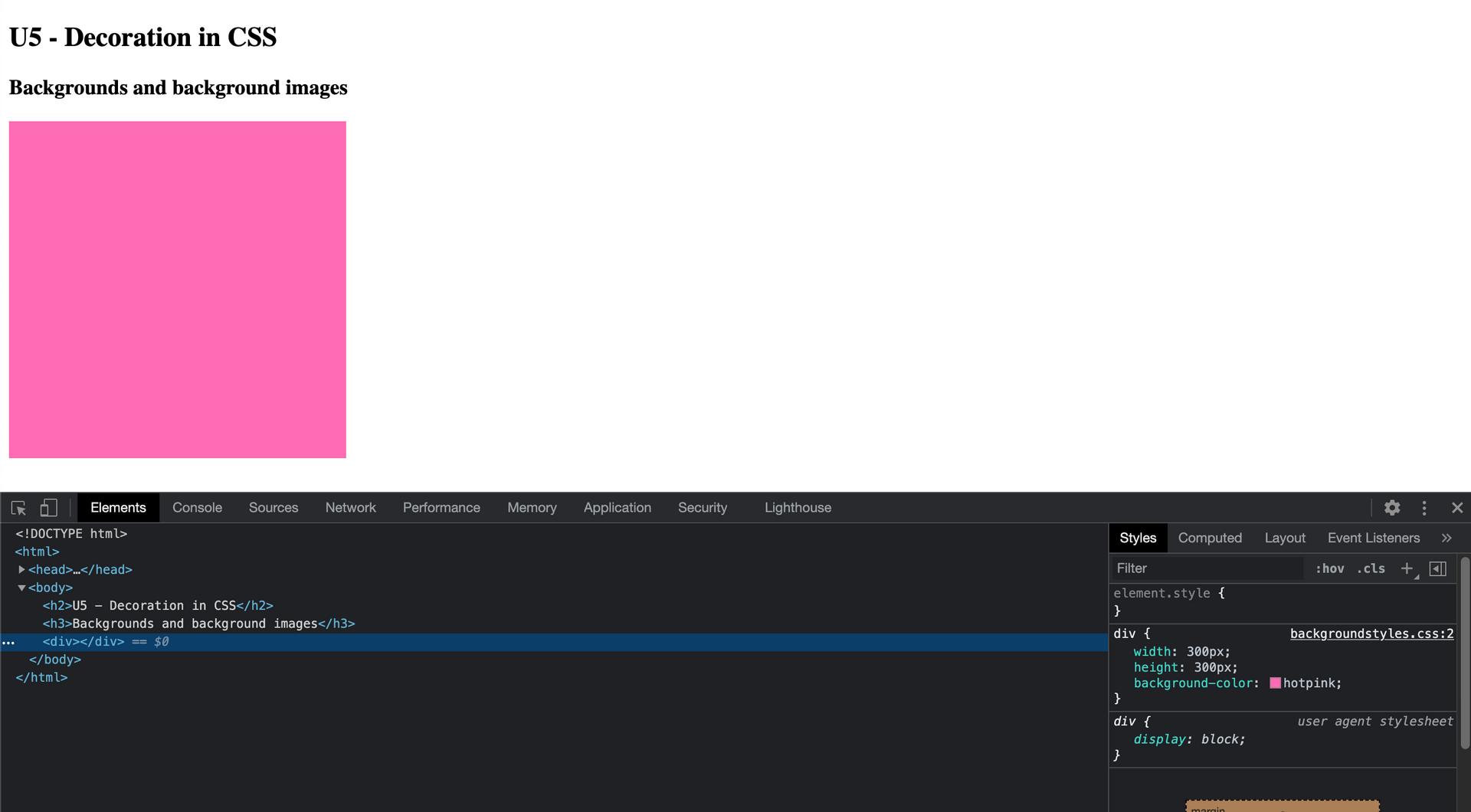
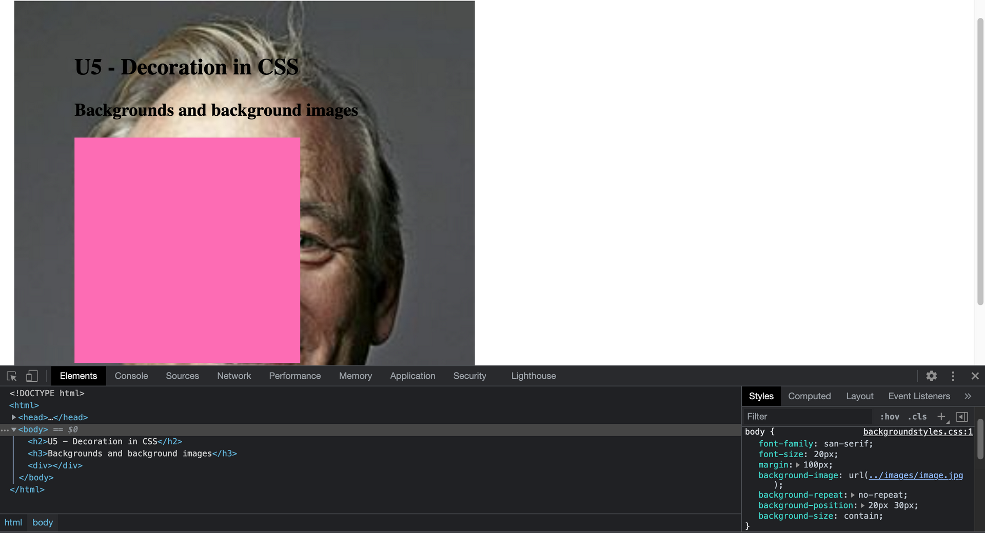
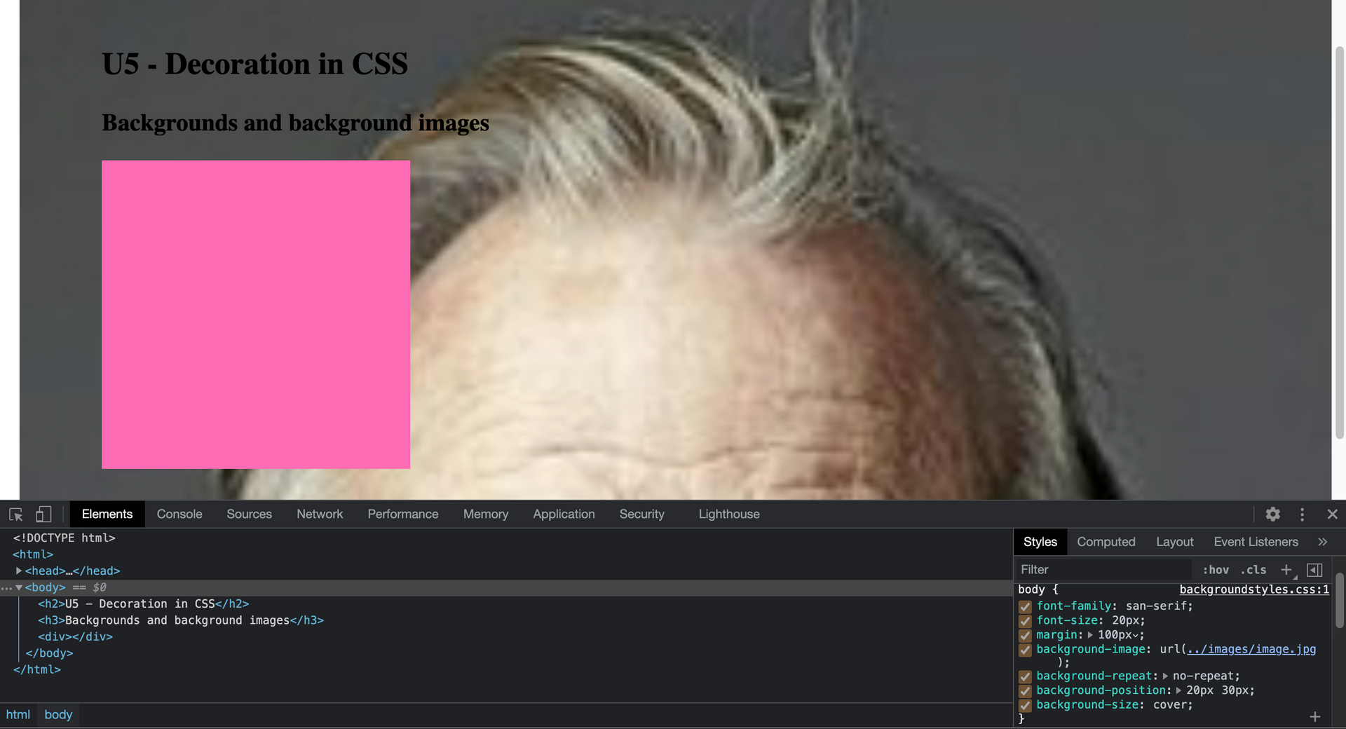
### Backgrounds and background images
#### background-color 可以用來設定背景顏色
```
/* CSS */
.box{
background-color: hotpink;
}
```
#### background-image 可以用來設定背景圖片
```
/* CSS */
.box{
background-image: url(images/image.jpg);
}
```
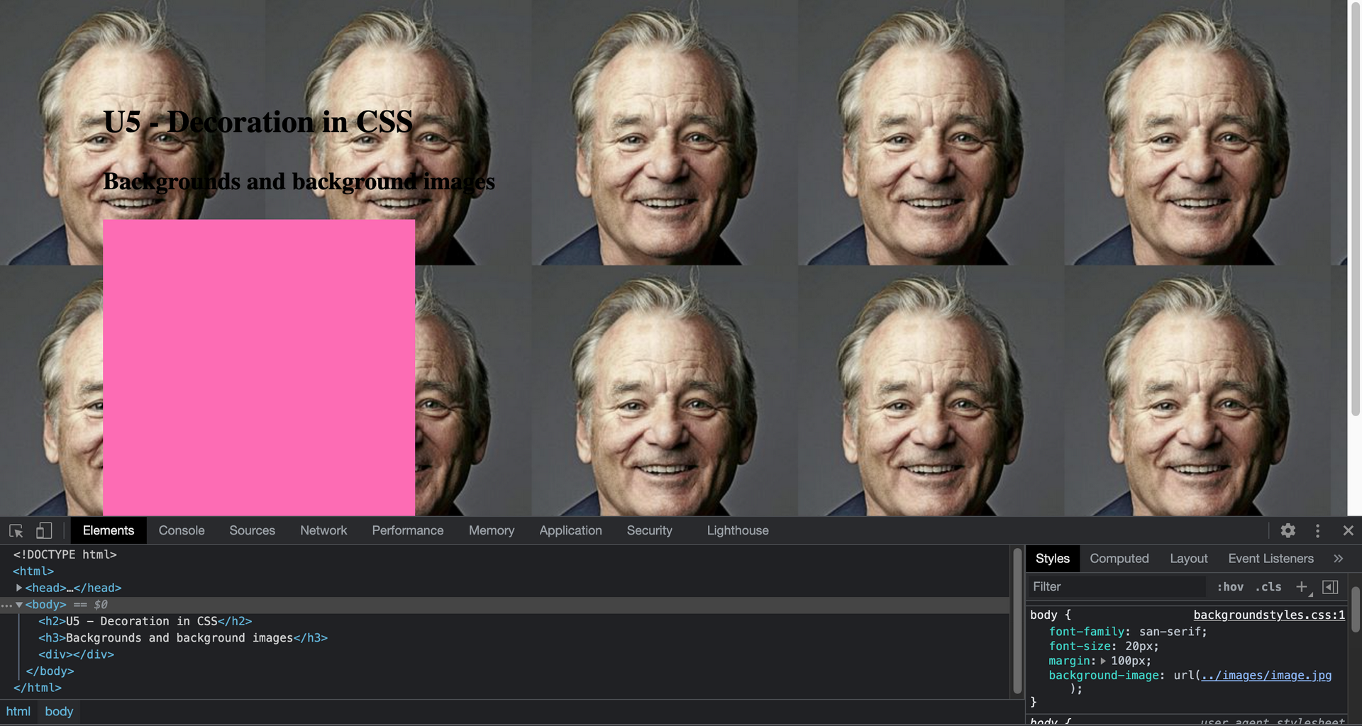
這裡會造成背景圖片自動 repeat 填滿背景
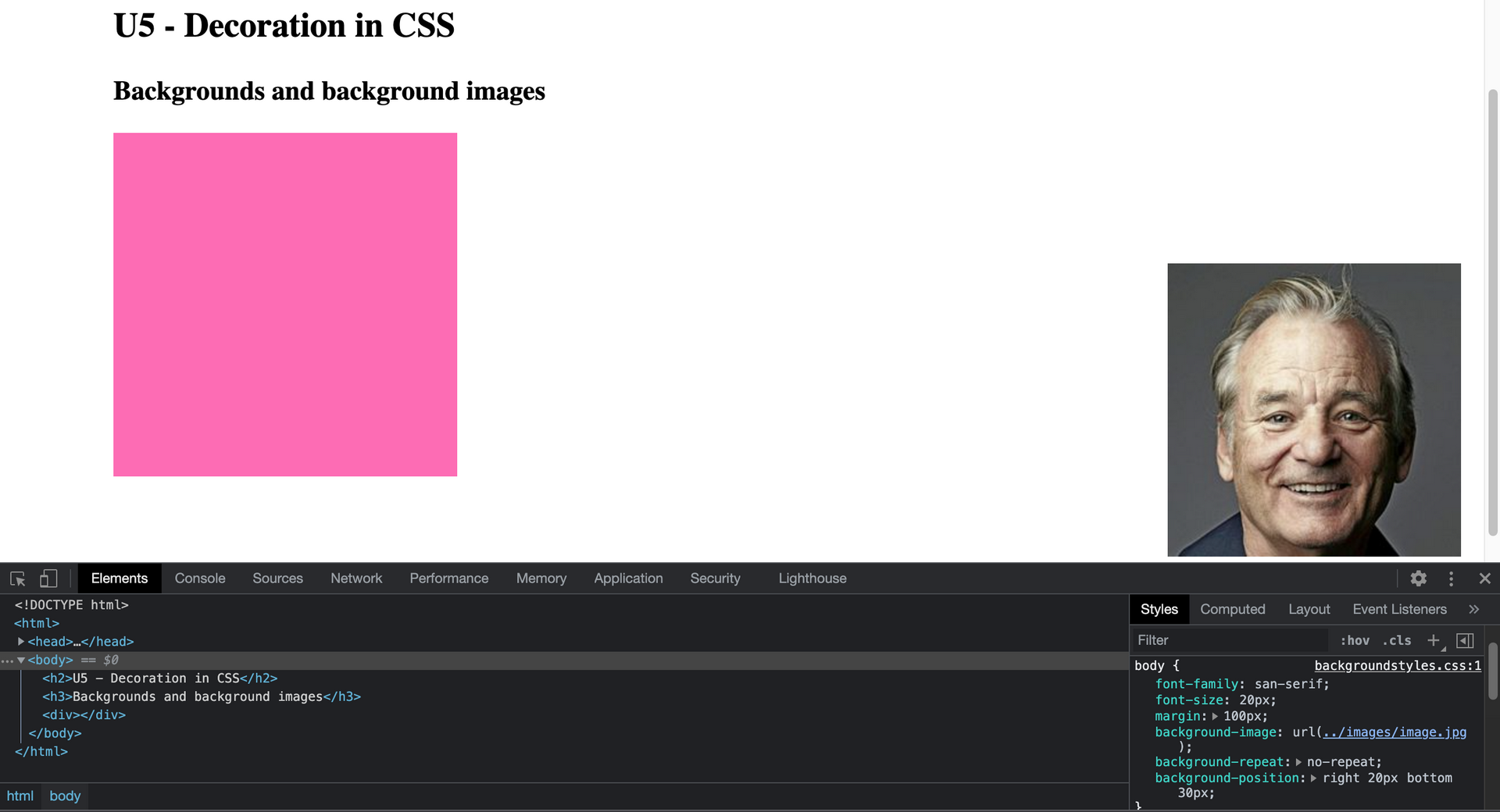
#### background-repeat 可以設定讓背景圖片不 repeat 填滿背景
```
/* CSS */
.box{
background-repeat: no-repeat;
}
```
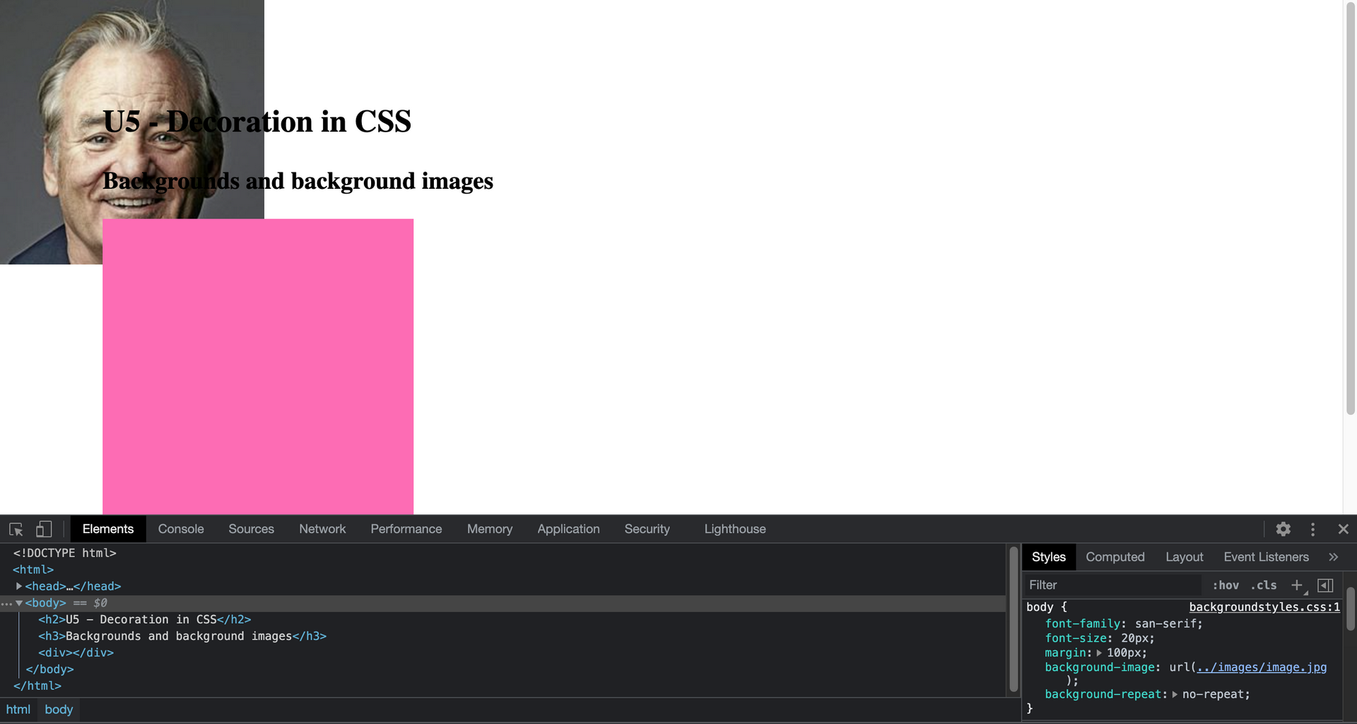
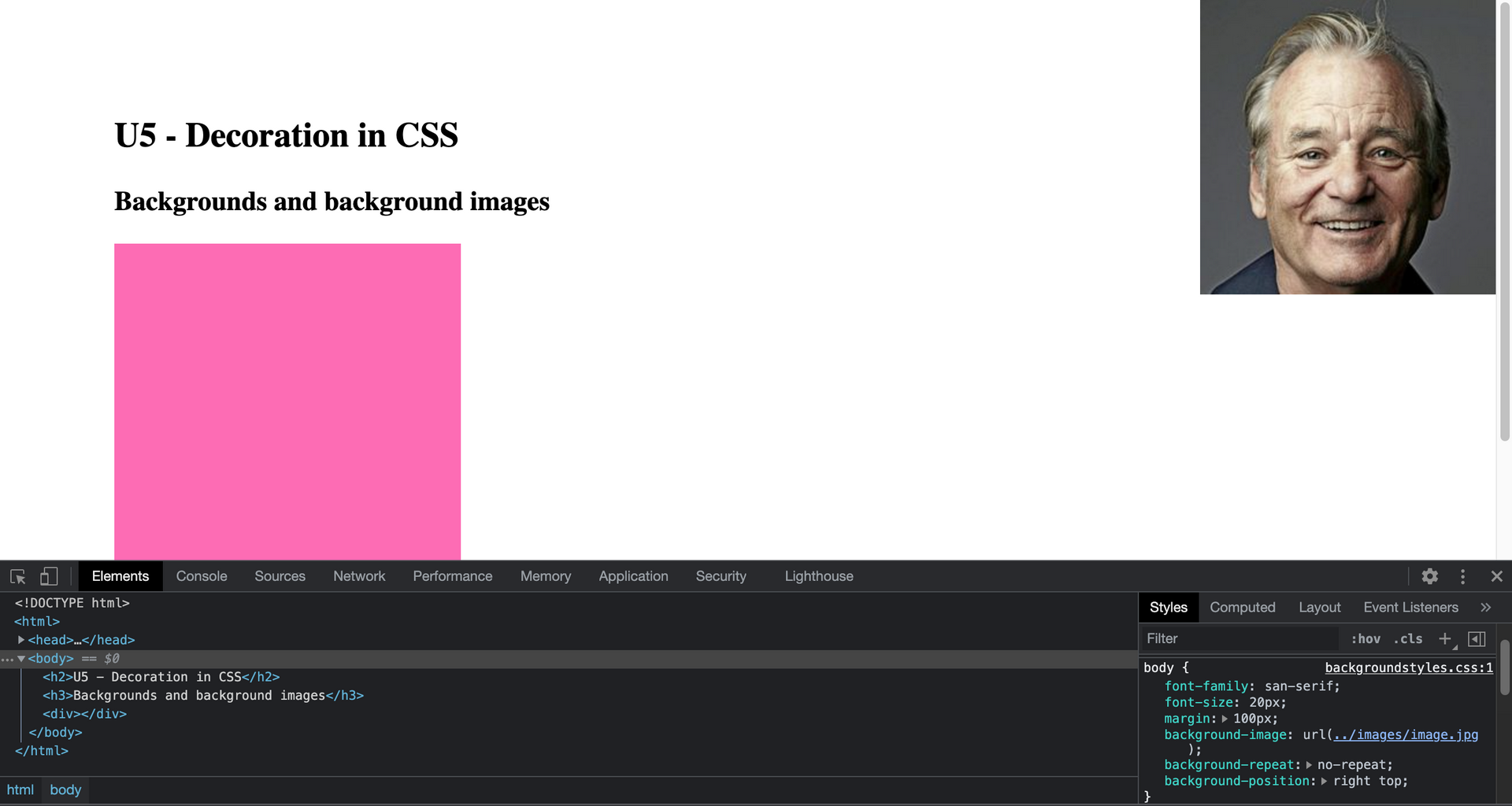
#### background-position 可以調整背景位置 ,例如 `background-position: right top;`則背景圖會在右邊、上面
```
/* CSS */
.box{
background-position: right top;
}
```
`background-position: 20px 30px;`則背景位置會從左邊數 20px 從上面數 30px
```
/* CSS */
.box{
background-position: 20px 30px;
}
```
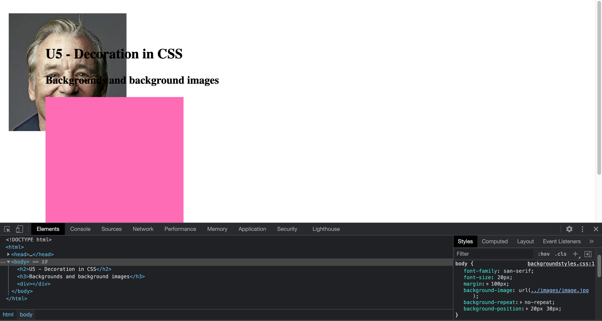
`background-position: right 20px bottom 30px;` 則可以調整背景位置從右邊數 20px 從下面數 30px
```
/* CSS */
.box{
background-position: right 20px bottom 30px;
}
```
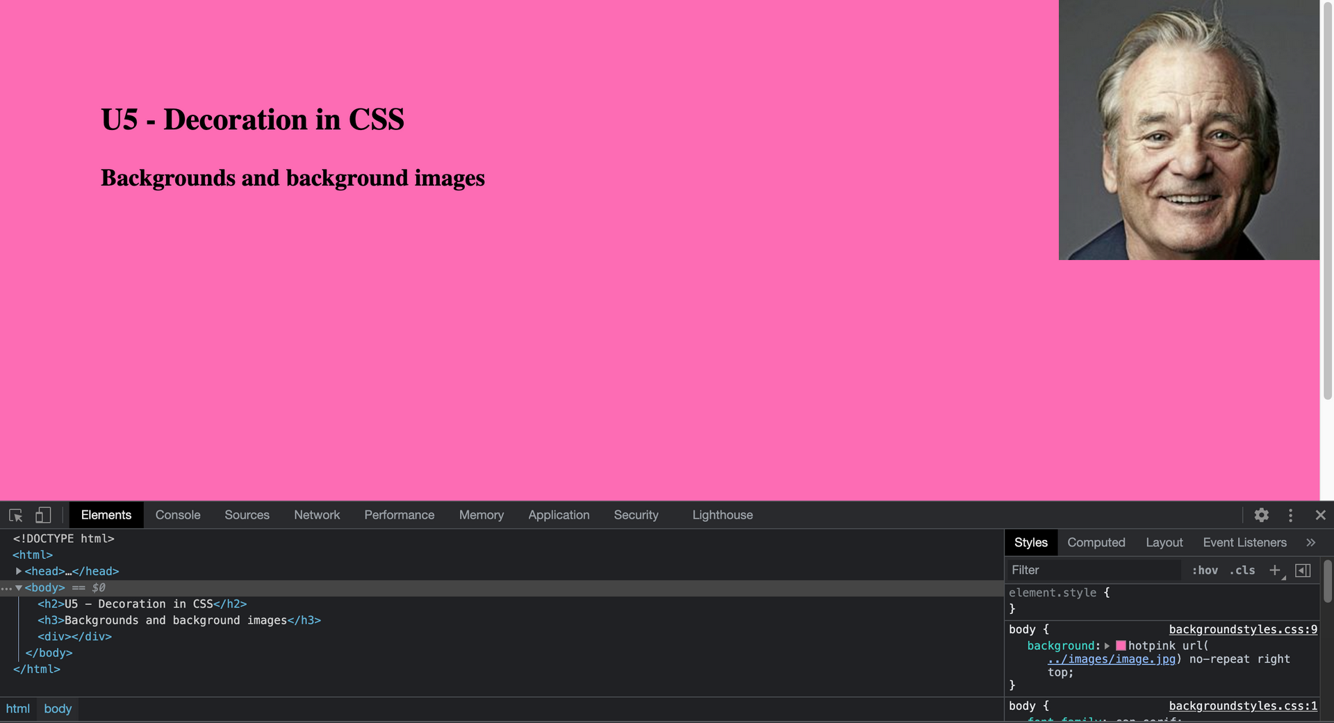
上面的方法有 reduced version,就是使用 background 屬性
#### background 屬性
```
/* CSS */
.box{
background: hotpink url(image.jpg) no-repeat right top;
}
```
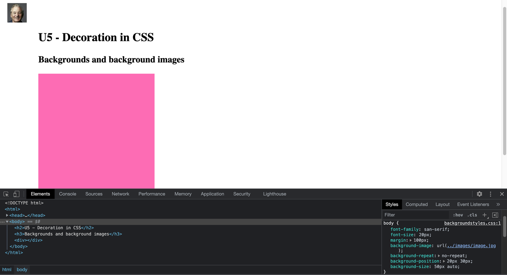
#### background-size 屬性可以設定背景的尺寸,例如 `background-size: 50px auto;` 是 x 軸佔 50px , y 軸自動按比例 resize, 或是 `background-size: 100% auto;` 則 x 軸佔 100% ,y軸等比例 resize
```
/* CSS */
.box{ /* X Y */
background-size: 50px auto;
}
```
##### `background-size: contain;` 還可以設定不管 container 大小多大,都可以完整顯示圖片
```
/* CSS */
.box{ /* X Y */
background-size: contain;
}
```
##### `background-size: cover` 則可以設定成圖片填滿整個 container,但圖片可能被切掉一部分
```
/* CSS */
.box{ /* X Y */
background-size: cover;
}
```
===
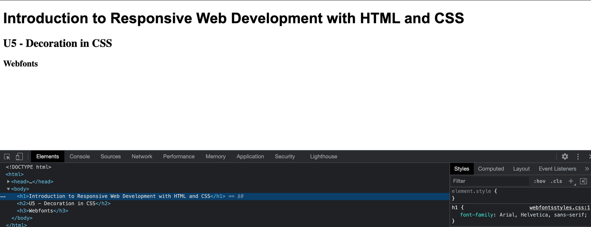
### Webfonts
以前 web 只能使用作業系統安裝的字型 (fonts) 選項只有 3 到 4 項: Arial、 Times New Roman、...還好現在我們有很多選擇,越來越多的 typographics houses 提供免費或付費服務.
#### font-family 屬性可以用來改變字型,可以設定多個字型, 依優先次序使用字型偏好 (preference), 瀏覽網頁的 user 系統依次查找有安裝的字型, 如下 CSS 範例會先找有沒有 Arial 字型,沒有再找 Helvetica ,依此類推...如下可以看到瀏覽時文字已經套用字型
```
/* CSS */
h1{
font-family: Arial, Helvetica,
sans-serif;
}
```
##### @font-face
除了系統提供的預設字型選項之外,我們也可以把自己的字型 include 進來使用,在 CSS 使用 @font-face 做宣告,包含許多屬性,就可以用在 font-family 字型,如下範例:
```
/* CSS */
@font-face{
font-family: Lobster;
src: url(fonts/lobster.woff)
format("woff"),
url(fonts/lobster.ttf)
format("truetype");
font-weight: bold;
font-style: normal;
}
h1{
font-family: Lobster, san-serif;
}
```
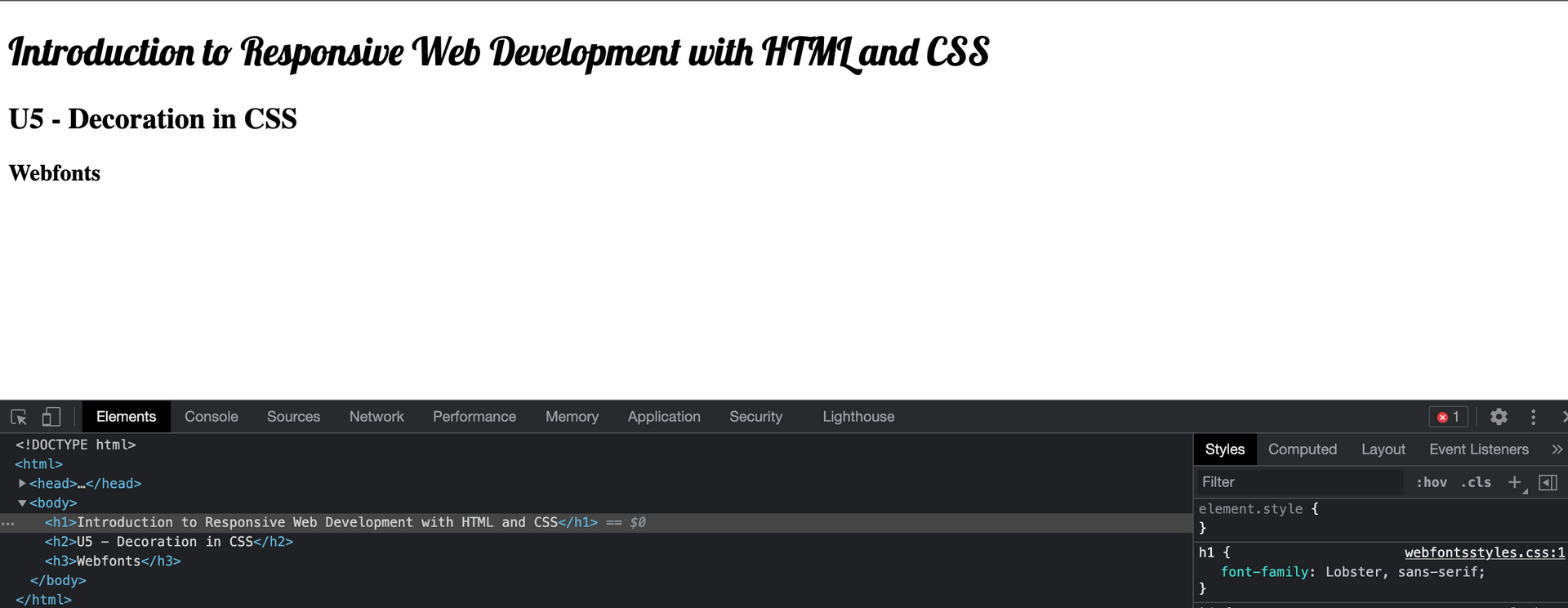
##### font-family 屬性
font-family 屬性是自己指定字型名稱
##### src 屬性
src 屬性是 source 的意思,指定 font file 的路徑,並指定 format 的 type,因為我們可以用一個以上的 typographic format, woff是 standard format 所有的 modern browser 都有支援,但舊的 browser 可能不支援,可以用","(comma)分隔開來, 在設定其他字型格式,像是truetype format
##### font-weight 屬性
font-weight 屬性可以設定 bold, normal
##### font-style 屬性
font-style 屬性可以設定 normal, italic...之類的
##### Google Fonts
另外也可以使用 commercial fonts 的服務,付費後可以透過 JavaScript code 套用到網頁上,例如. Fonts.com 或 Hoefler's typography.com
也有像 myfonts.com 是買 typeface 的 license 後,可以把字型檔案放到 server 使用.
這邊使用 Google Fonts 免費服務的字型做例子,我們只需要放一個 direct link 指到 Google Fonts 的字型, 就可以從那裡下載:
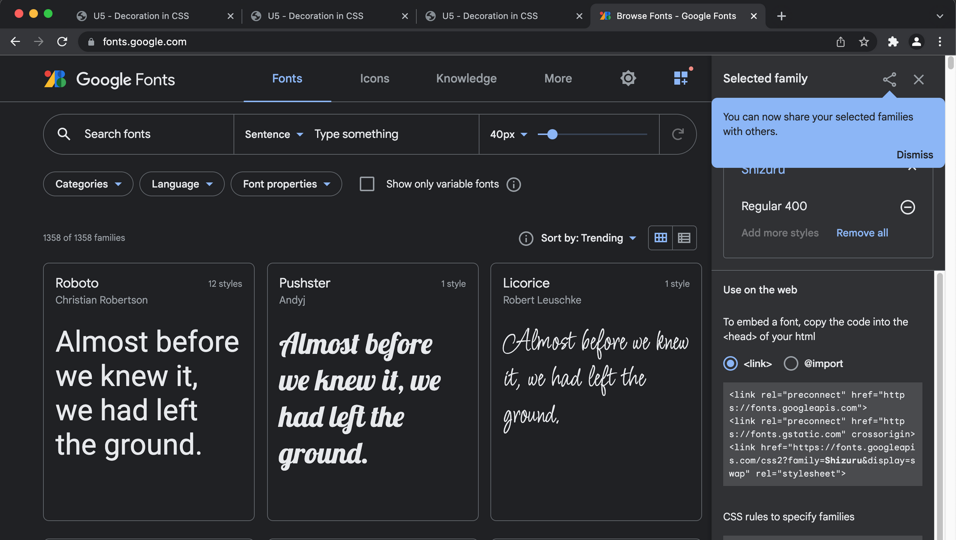
可以使用分類搜尋,選取好後,把 Google Fonts 提供的 "To embed a font, copy the code into the <head> of your html"底下所列的 code 貼到 html 檔,"CSS rules to specify families"底下所列的 code 貼到 CSS 檔,如下是 "Open Sans" 字型範例:
```
<!-- html -->
<head>
<link rel="preconnect" href="">https://fonts.googleapis.com">
<link rel="preconnect" href="


