恩,許久不見,但是旁邊的小屋人氣依舊不變,非常感謝你們。
那今天呢,想給大家認識認識所謂的顏色!?


轉貼網址:http://www.aboutcg.com/18003.html#!prettyPhoto 點我進入轉貼網址
那今天呢,想給大家認識認識所謂的顏色!?
很多人,學了畫畫,配了各種顏色。
但是!!卻有許多人不知道怎樣才是最鮮豔、最好看的配色。
所以今天要來分享一位外國的大師,所說的"理解色彩"
Understanding Colors-理解色彩
翻譯:層層(翻譯小組成員)
相關視頻下載鏈接: http://www.aboutcg.com/17571.html
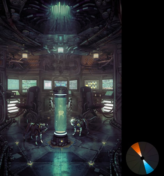
When used correctly, color can change the mood of the image, or impact the story. It can also draw the viewers eyes to a focal element.
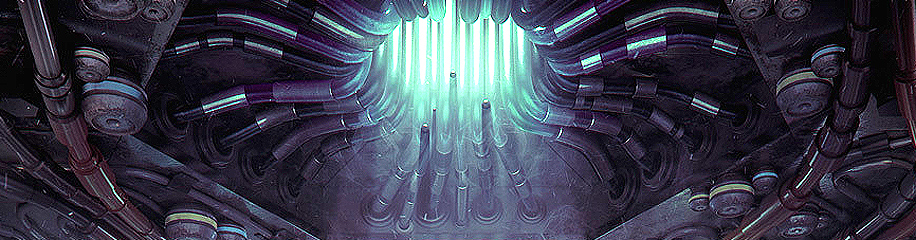
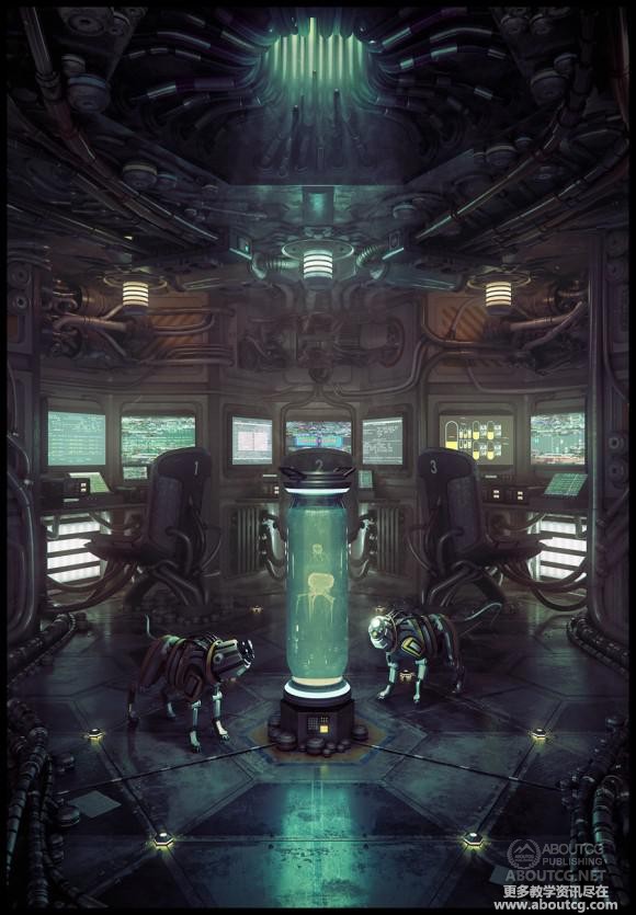
In the image below, color is used effectively to focus your attention on the tube. And the controlled color palette also helps keep the image calm.
如果運用得當,色彩不但可以影響一幅作品傳達的情緒或表述的故事,也可以讓觀者的視線集中於某一元素。
下面的這幅作品,顏色的有效運用使你的注意力集中在管子上,而顏色的搭配使得畫面沉靜安定。
Courtesy of Cornelius Dämmrich
Color is used effectively in this image to keep the mood playful and light:
顏色的合理搭配使得這幅作品的情感輕鬆明快:
Courtesy of Anders Ehrenborg and Bill Presing
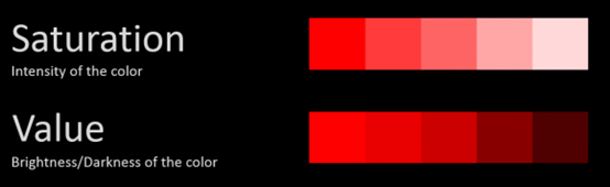
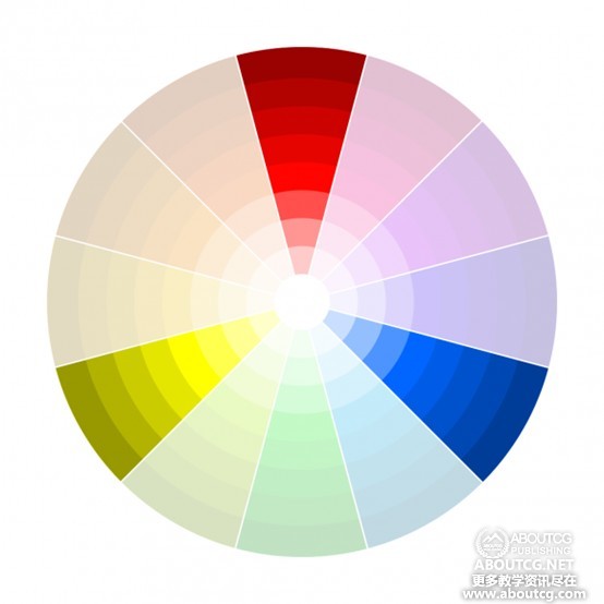
Saturation and Value
飽和度和明度
A lot of people think Colors are all about harmonious relationships. But Saturation and Value are equally as important, if not more so.
Without a clear understand of what saturation and value is, and why it’s important, no color scheme will ever help you.
Saturation is about intensity, and Value about Brightness/Darkness.
很多人認為顏色只要搭配和諧就萬事俱備了。但是飽和度和明度也同樣重要。如果不明白它們的重要性,那些顏色方案就幫不到你。
飽和度是色調的強弱,而明度則關乎明暗。
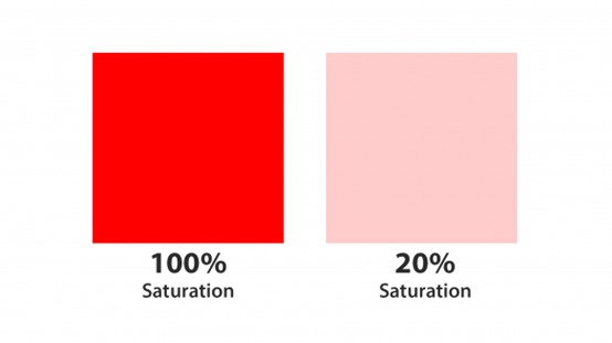
At 20% saturation, red turns into a fleshy pink.
飽和度為20%的紅色就變為肉粉色。
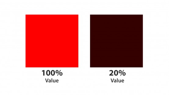
And at 20% value, red becomes a dark muddy brown.
明度為20%的紅色則變為深土褐色。
In fact just using the color red as a starting point, you can create these shades simply by changing the saturation and value:
事實上,將紅色作為起點,我們只需要改變飽和度和明度,就可以創造出下面這些漸變色。
“Yeah, but why is this important?”
“是的呢,但是這有什麼重要?”
Because Saturation and Value can make or break your image.
因為飽和度和明度可以成就一幅作品,也可以毀掉一幅作品。
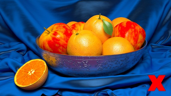
The biggest problem I see with CG renders is oversaturation:
在CG圖像的渲染中,我認為最大的問題就是飽和度過高:
Example of an overly saturated scene
一個飽和度過高的場景的例子
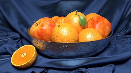
By forcing strong saturated colors on the viewer, you give them no where for their eyes to rest.
Just like you never go full retard, you should never go full saturation.
給觀者看飽和度過高的圖像,他們會不知道看哪裡好。
Here’s a much better level:
這幅作品更高一籌:
Corrected scene
校正後的場景
Not to say that saturation is bad though. In fact it can be excellent when used in moderation:
不是說飽和度不好,事實上,適當的使用可以得到非常好的效果:
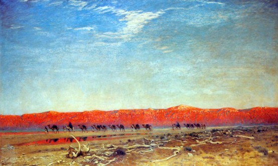
Maxfield Parrish – Salzkarawane am toten meer (from ArtRenewal.org)
The striking red mountains catch your eye immediately. Doing so makes it the focal element of the entire image.
醒目的紅色山巒迅速抓住你的眼球,這樣的安排使其成為整幅作品的焦點。
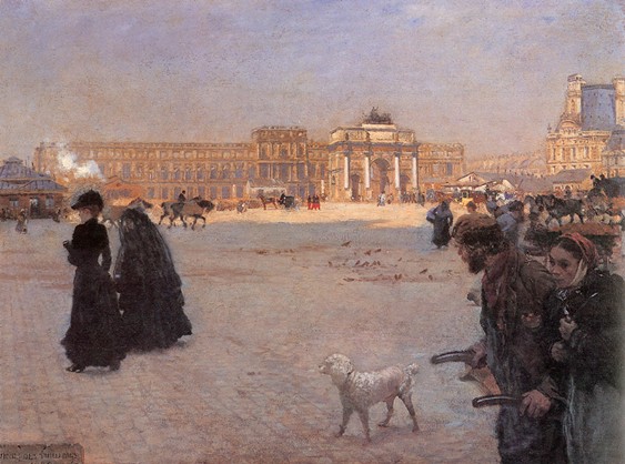
In this image, a single note of saturation helps to guide your eyes through the scene:
這幅作品中,增加一點飽和度,使你注意到遠景:
Giuseppe de Nittis – The place de carrousel and the ruins of the tuileries palace in 1882
(from ArtRenewal.org)
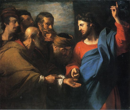
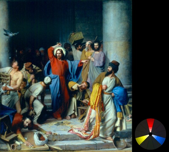
And in this image, saturation is used to make Jesus look powerful amongst a group desaturated onlookers.
這幅作品中,高飽和度使得耶穌在一群低飽和度的旁觀者中凸顯力量。
John Singleton Copley – The tribute money (from ArtRenewal.org)
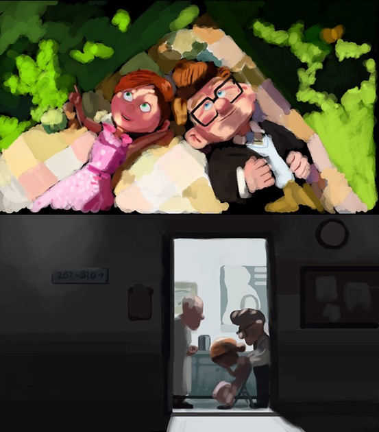
Saturation can even alter your mood. At the start of Pixar’s UP, the colors are vibrant and alive to signify their joyous life. But when tragedy strikes, the colors are immediately desaturated.
飽和度還能更換你的情緒。在皮克斯出品的《飛屋環遊記》開篇,色彩生動活潑,預示著他們的幸福生活。但是當不幸降臨,色彩迅速轉為低飽和度。
This simple touch of desaturation makes the viewer feel the pain and loneliness of the characters. It’s used extensively in hollywood and first-person shooters.
低飽和度的運用使觀眾對角色的痛苦孤獨感同身受。這一方法廣泛應用於好萊塢和第一人稱射擊遊戲中。
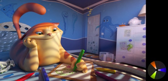
For cartoons, saturated bright colors can play to the artists advantage, as it immediately tells the viewer that this is fake:
對於動畫,鮮亮的顏色更能發揮藝術家的優勢,因為他讓觀眾很快看出這是製作出來的:
Courtesy of Anders Ehrenborg and Chris Sanders
So as you can see, learning how to use Saturation and Value effectively can vastly help tell your story.
With that out of the way, we can finally get into...
所以,學會使用飽和度和明度可以更好地幫你講故事。
從而,我們可以得到...
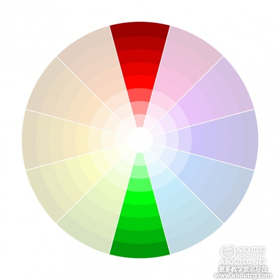
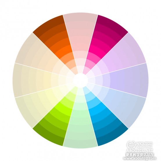
Color Harmonies (aka Color Schemes)
顏色調和(又名配色方案)
Everyone knows that some colors look better together than others, but it can get confusing if you try to remember which ones.
Here are 6 of the most effective Color Harmonies...
大家都知道,某些顏色組合會比其它的好看,但是你要想一一記住又容易混淆。
下面有六種最有效的配色方案:
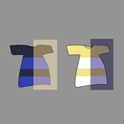
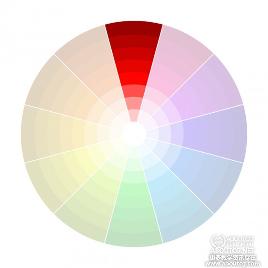
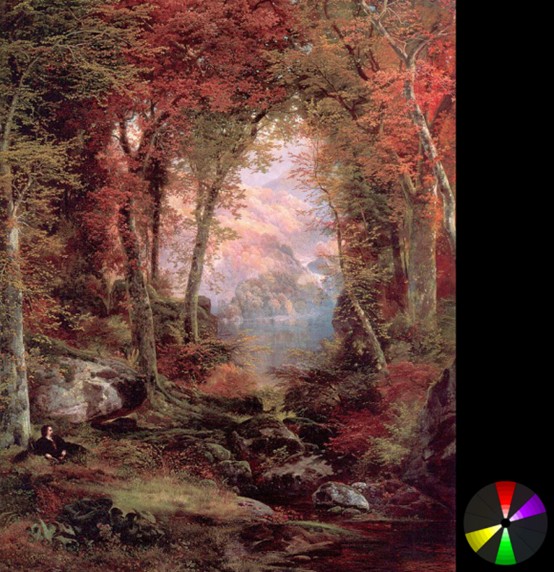
Monochromatic
單色
This one is the easiest to remember, because it’s just one color.
Due to the absence of other colors, the viewer is left to focus on the differing values and saturation. Making it great for single subject shots or dramatic atmospheric scenes.
這種最容易記住,因為只有一種顏色。
由於沒有其他顏色,觀者就會把注意力放在明度和飽和度上。這適用於單一物體的鏡頭或者氣勢恢宏的大場景。
Examples:
例如:
Hermann David S. Corrodi – The ambush (from ArtRenewal.org)
Courtesy of David Munoz Velazquez and Fran Camos
Analogous
近似色
Analogous harmonies use colors that are adjacent to each other on the color wheel.
It’s frequently seen in nature, making it great for creating a calm, comfortable and peaceful mood.
近似色就是使用色輪上相鄰的顏色。
這在大自然中經常見到,適合表達沉靜、舒適、平靜的情緒。
Examples:
例如:
Created by Giovanni Boldini – Portrait of madame E L Doyen (from ArtRenewal.org)
Courtesy of Carlos Ortega Elizalde
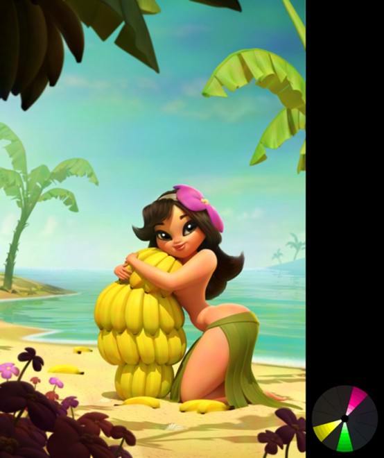
Triadic
三色
This one is probably one of the hardest to pull off well. It’s three colors that are equally distant to each other.
It’s hard to do, because if used in equal amounts it can create ugly chaos.
It’s best used for cartoon style scenes since the colors can look almost childish.
這可能是最難表現的色彩方案中的一種。三種顏色的間距是相等的。
它之所以難把握是因為如果平均分配這三種顏色就會一團糟。
這種方案最好應用於卡通風格的場景,因為這些顏色看起來會孩子氣。
Examples:
例如:
Carl Heinrich Bloch – Casting out the money changers (from ArtRenewal.org)
Courtesy of Ehsan Hassani Moghaddam
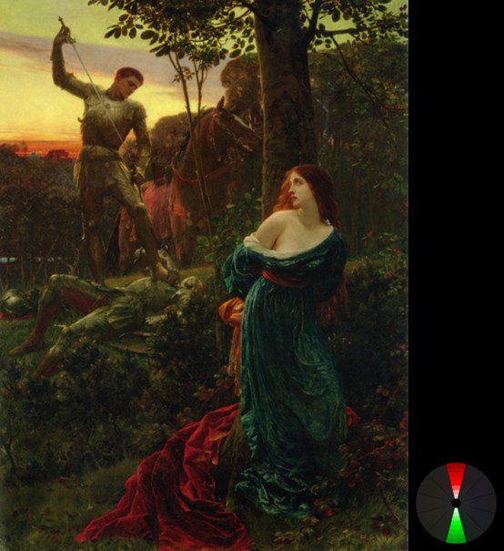
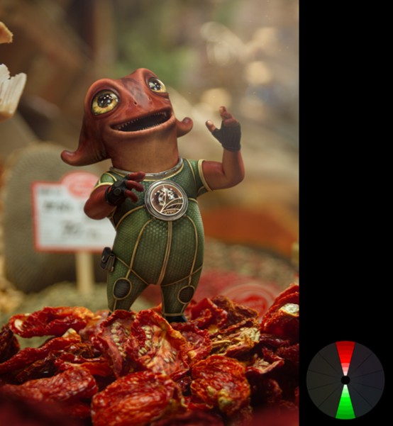
Complimentary
互補色
This one is definitely the most popular: colors on opposing sides of the wheel. They just naturally go well together.
A common misconception is to use equal amounts of each, but this will more than likely create ugliness. You want to choose one color as the predominant one (usually the cooler color) and use the other to create splashes of interest. Use lots of browns and greys for a better effect.
這無疑是最流行的配色方案:顏色在色輪兩端。它們自然而然可以很好地搭配在一起。
一個普遍的錯誤概念是運用兩種顏色的比重相同,但是這樣多半會很難看。你需要選擇一種顏色作為主色(通常選擇冷色)並用另一種顏色添加亮點。再加上很多棕色和灰色來達到更好的效果。
Examples:
例如:
Frank Dicksee- Chivalry (from ArtRenewal.org)
Courtesy of Cornelius Dämmrich
Courtesy of Toni Bratincevic
Courtesy of Jean-Michel Bihorel
Courtesy of Cornelius Dämmrich
Courtesy of Baolong Zhang
Complementary colors accentuate each other. Meaning that a dull green against a red background, will suddenly look more saturated. So be careful of the saturation.
互補色會互相強調。就是說暗綠色襯在紅色背景上,會顯得飽和度更高。所以一定要注意飽和度的控制。
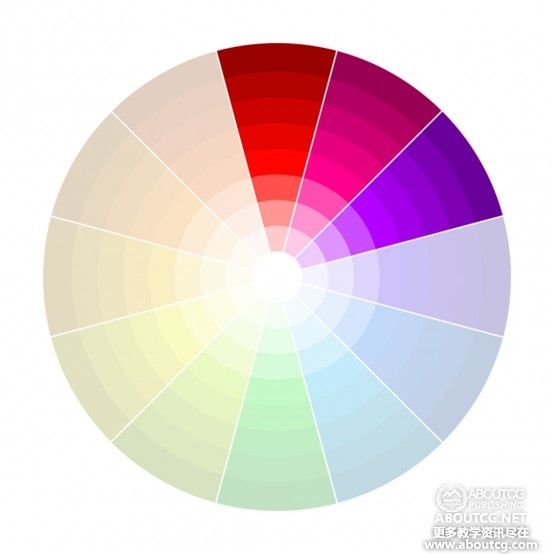
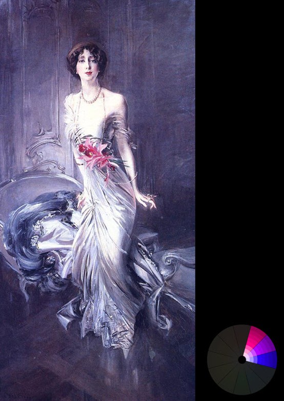
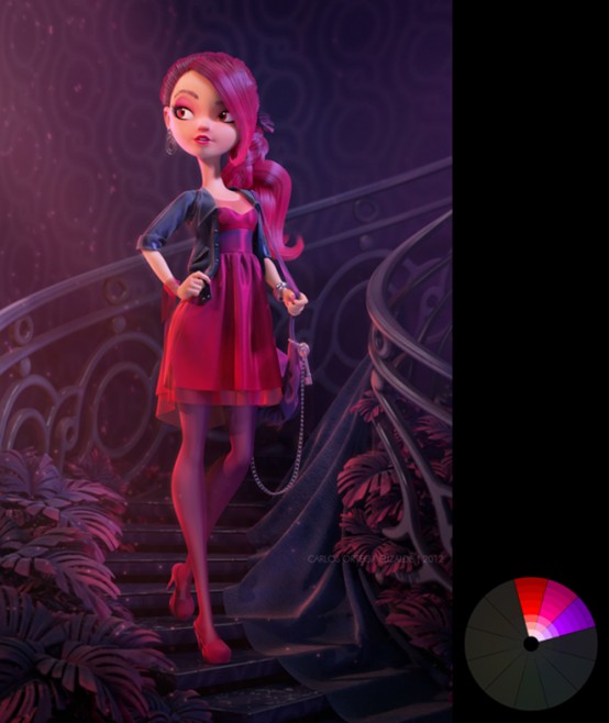
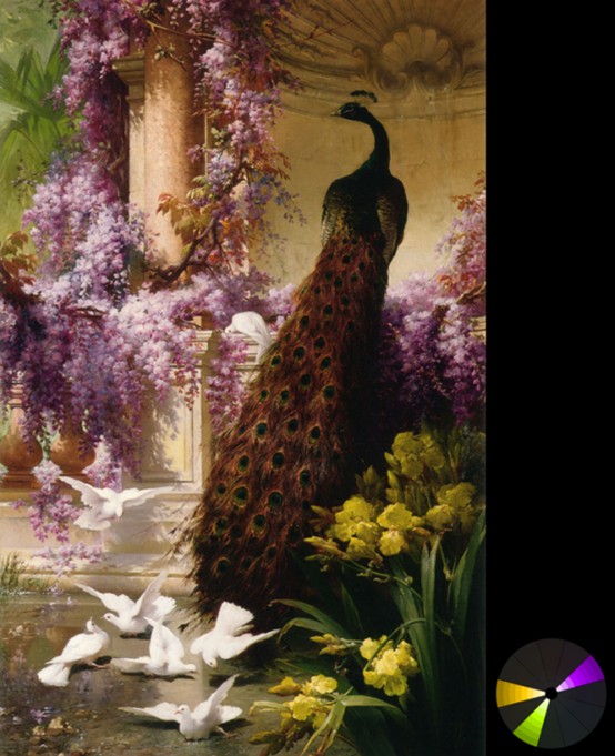
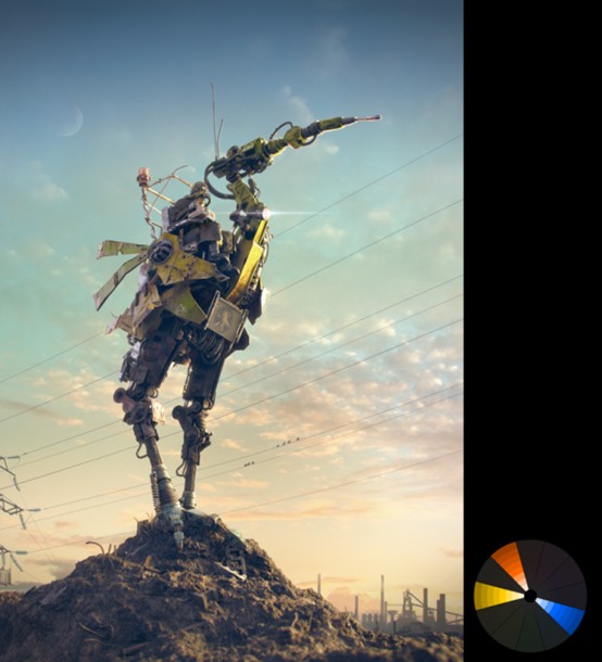
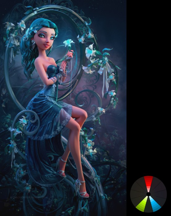
Split Complimentary
分裂互補
Similar to the complimentary harmony, this involves taking one opposite color and splitting it. This is useful for extending your palette (when two colors aren’t enough), or to create a more joyous mood.
類似於互補配色方案,這種方案將其中一種相對的顏色分裂成兩個。這有助於豐富你的色盤(當兩種顏色不夠的時候),或者表達更愉悅的情緒。
Examples:
例如:
Eugene Bidau – A Peacock and doves in a Garden (from ArtRenewal.org)
Courtesy of Jaroslaw Waskowiak
Courtesy of Daniil Alikov
Courtesy of Carlos Ortega Elizalde
Courtesy of Anthony Guebels
Courtesy of Anders Ehrenborg and Bill Presing
Double complimentary
雙互補
Just like the complimentary harmony, only double. Two pairs of complimentary colors (doesn’t matter where on the wheel).
You have to be careful with this one as using equal amounts of all four will create chaos. It looks best when the foreground is one pair, and the background is another. Mixing the pairs can get tricky.
類似於互補方案,只不過有兩組互補色(無所謂在色輪的什麼位置)。
你需要小心使用這種方案,因為等量使用四種顏色會一團糟。前景一組互補色,背景一組互補色會更好。打亂組合會很棘手。
Examples:
例如:
Thomas Moran – The autumnal woods (under the trees) from ArtRenewal.org
^Notice the complimentary pair of colors in the foreground, and another in the back?
注意到前景一組互補色,背景一組互補色了嗎?
Courtesy of Rafael Reis
Courtesy of Sergii Andreichenko
Courtesy of Anders Ehrenborg and Chris Sanders
Summary
總結
Go easy on the saturation… use it to help tell your story or guide the viewers to what’s important.
Pick the color harmony that best suits what you want to achieve (calmness, playfulness, suspense).
Study the classics, coz they knew what they were doing. ArtRenewal.org has hundreds of historic paintings which you can view for free.
Experiment! The best way to get better is to just dive in. Don’t get stressed if you fail miserably the first few times.
量運用飽和度...用它來輔助敘述故事或者吸引觀者去看重要的部分。
根據你要表達的東西選擇合適的配色方案(沉靜、愉悅、焦慮)
學習經典,因為那是前人的經驗。ArtRenewal.org網站有很多可免費欣賞的舊作。
試驗!最好的進步方法就是潛心鑽研。如果你前幾次失敗了,不要有壓力。
Resources
資源
SmashingMagazine – 3 Part Series on Color Theory. Goes more in-depth into the theory of color.
Kuler – Awesome online app for helping you create harmonious color schemes.
Colrd – Great for seeing the color schemes used in photos and illustrations.
Designspiration.net – Awesome for finding images with a specific color scheme
ShutterStock Spectrum – Fun site that allows you see stunning photos using specific colors.
colourlovers.com – Community of Color Lovers. Find popular palettes or make your own.
design-seeds.com – Beautiful photos and their main colors.
Hope you found this useful! Now get out there and make some colorful art
Smashing雜誌——顏色理論三部曲。更深入的顏色理論。
Kuler——出色的在線軟件幫助你創造更好的配色方案。
Colrd——更好的查找照片和插畫中的配色方案。
Designspiration.net——很好的網站,允許你以色搜美圖
ShutterStock Spectrum——也是可以以色搜美圖的網站
colourlovers.com ——顏色愛好者的社區,可以找到流行的配色或者創造屬於你自己的配色方案。
design-seeds.com——有美圖,並顯示它們運用的主要顏色。
希望對你有幫助!現在關閉網頁去創造色彩豐富的作品吧^^
轉貼網址:http://www.aboutcg.com/18003.html#!prettyPhoto 點我進入轉貼網址
看到這邊,覺得是不是又學到了很多啊?
還有一種是色溫的對比,不過這也是要找找看呢....
還有一種是色溫的對比,不過這也是要找找看呢....